Selina Hostels
Project Context
Selina is a hospitality brand created for a new generation of travelers moving between work, culture, and exploration. As the brand grew across locations, it needed a flexible identity system that could support lodging, coworking, wellness, events, and local experiences under one global platform.
Design Approach
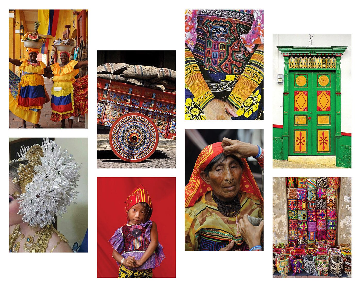
I helped develop a visual language inspired by South American indigenous cultures, regional patterns, craft, and architecture. The system uses illustration, pattern, and color to create a hospitality identity that can scale globally while still making space for local expression.
Brand Identity
Art Direction
Pattern Design
Package Design
Hospitality Design
Brand Direction
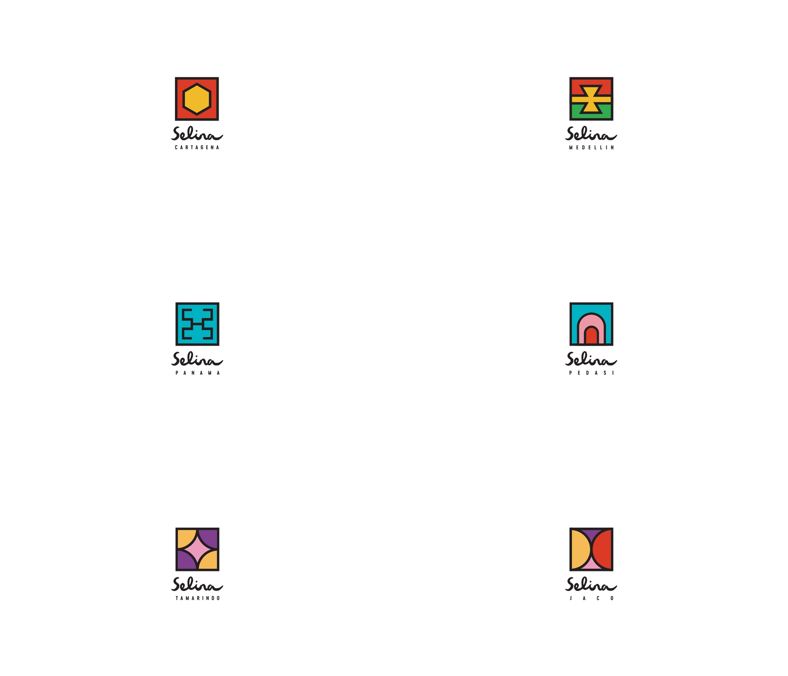
The brand direction balances travel, culture, and community. Rather than feeling like a traditional hotel or backpacker hostel, Selina was designed to feel expressive, social, and rooted in the energy of each destination.
Logo / Identity
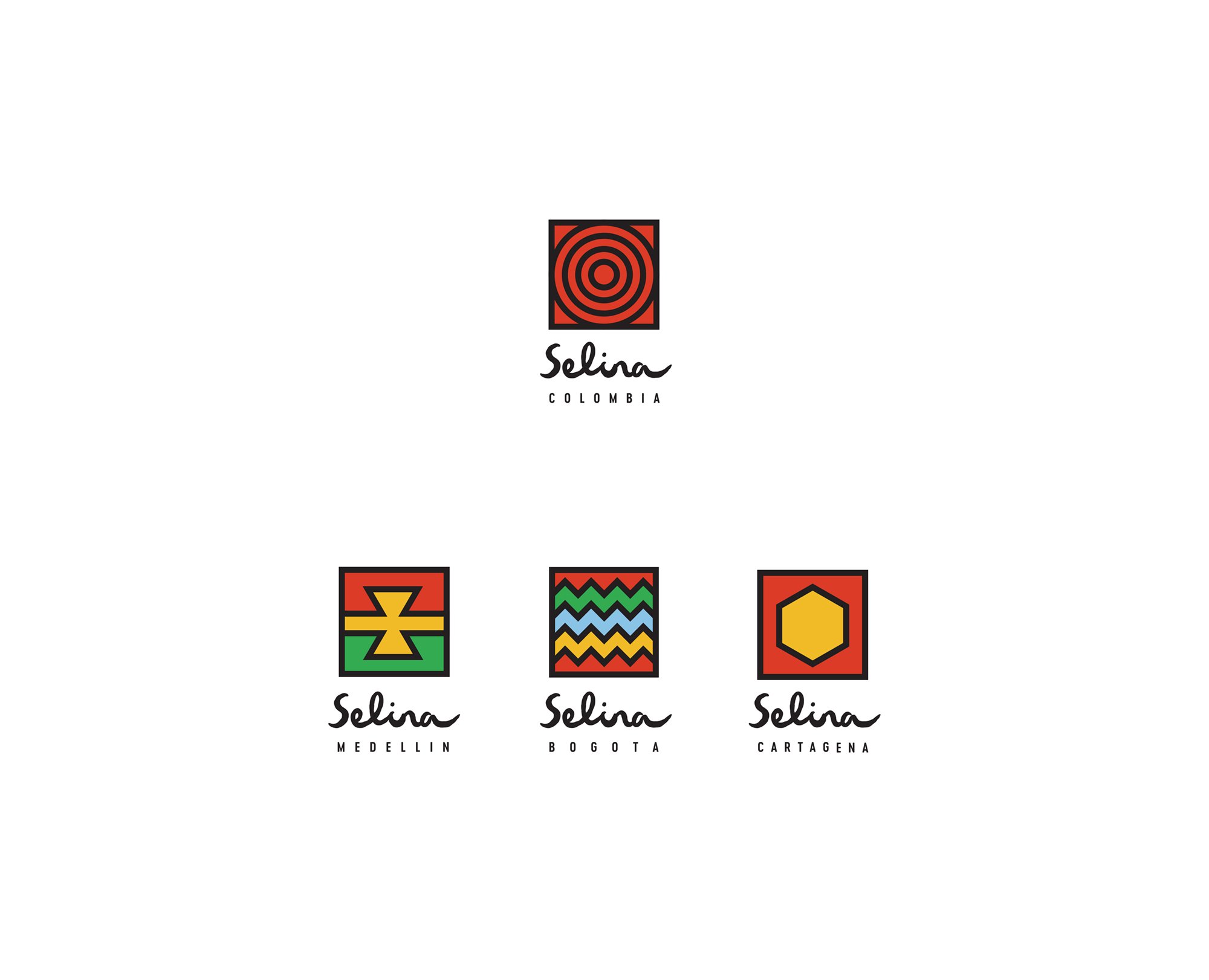
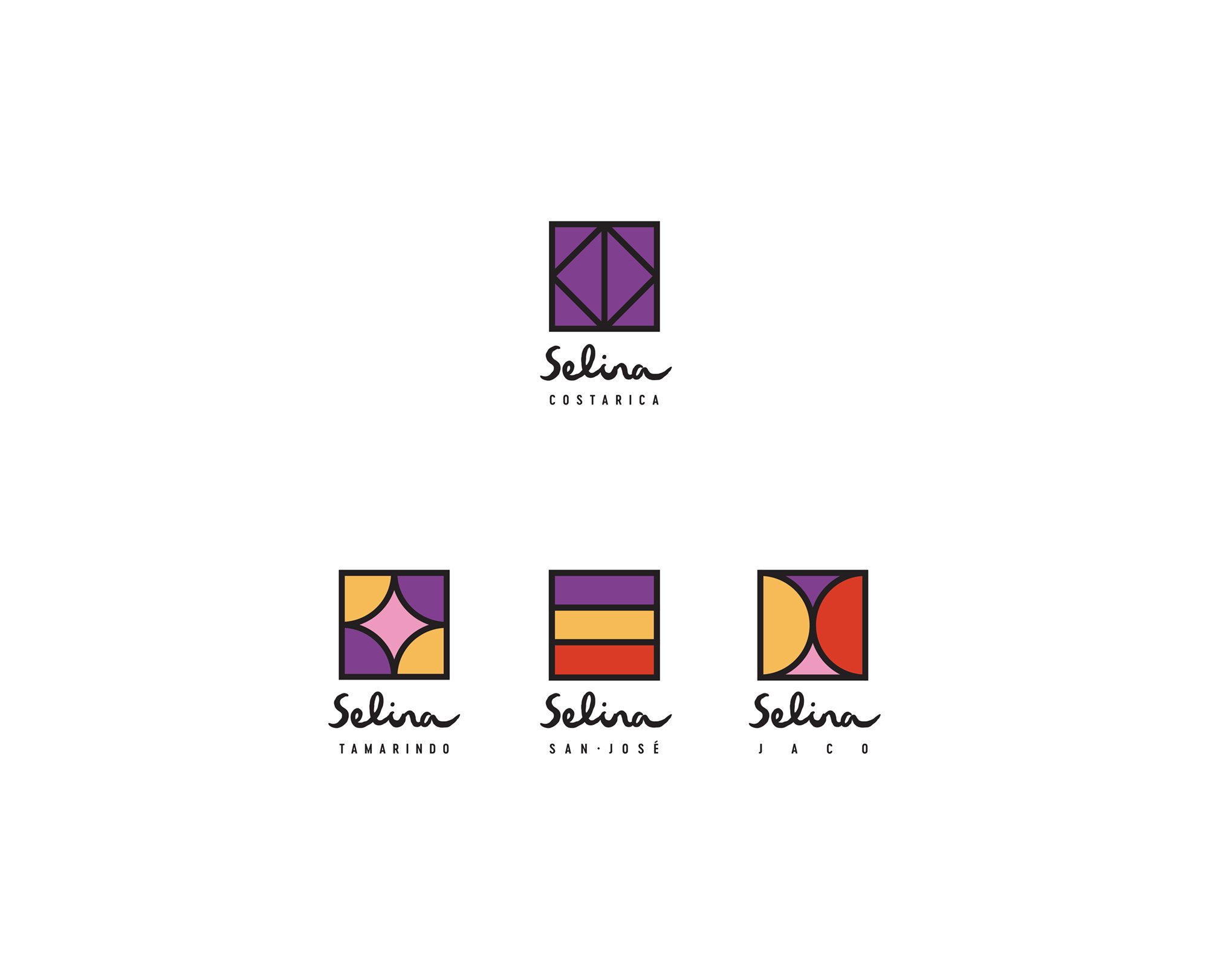
The identity system was built to feel flexible across many locations and touchpoints. It needed to support everything from lodging and coworking to food, events, wellness, and retail while still feeling recognizable as one brand.
Pattern System
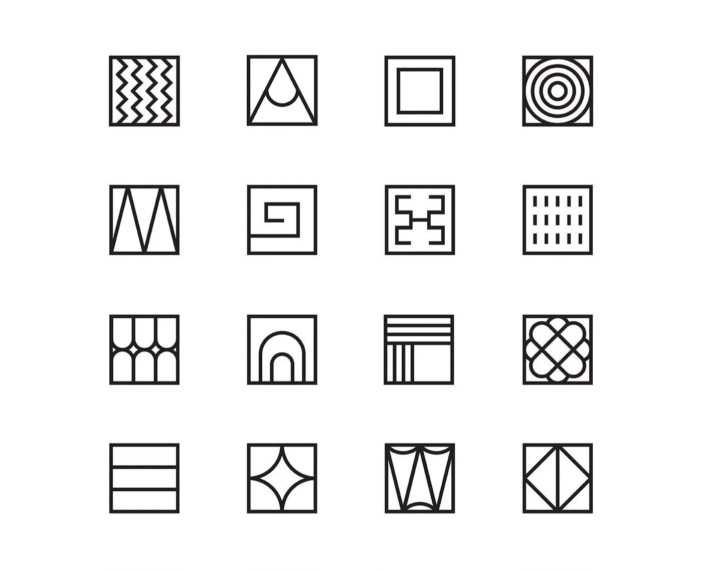
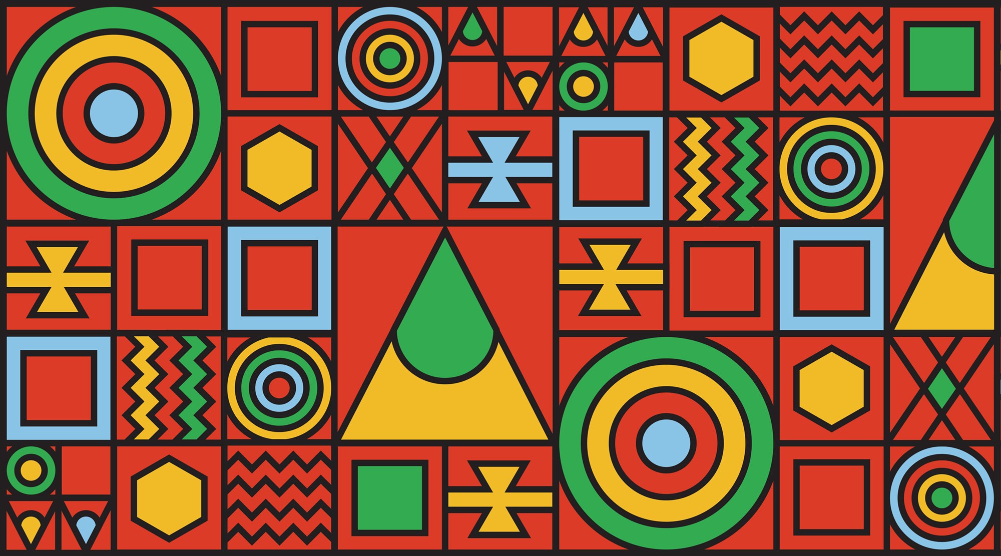
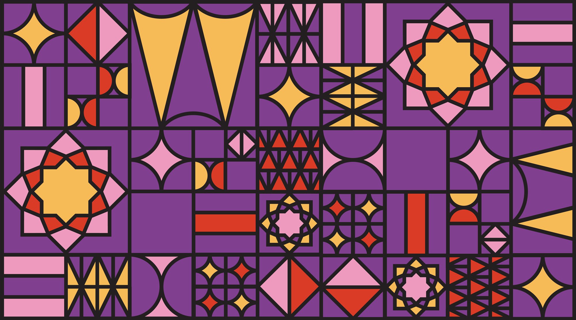
The pattern system became one of the main tools for bringing local character into the brand. Bold shapes, rhythmic compositions, and cultural references help each location feel distinct while still sitting within the larger Selina identity.
Color Palette
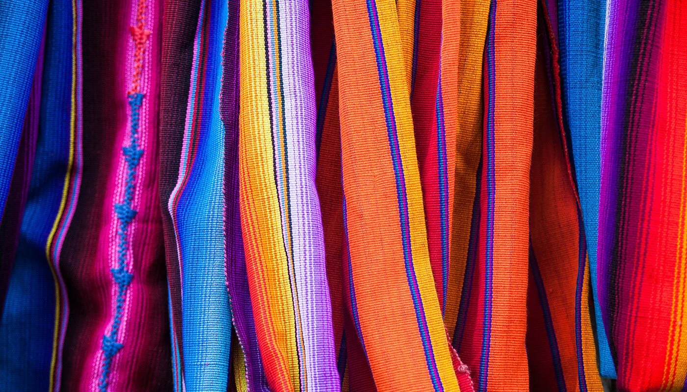
The palette uses bold, earthy, and sun-washed tones inspired by the landscapes, textiles, and architecture of Latin America. The colors give the identity energy and warmth while supporting the brand’s adventurous spirit.
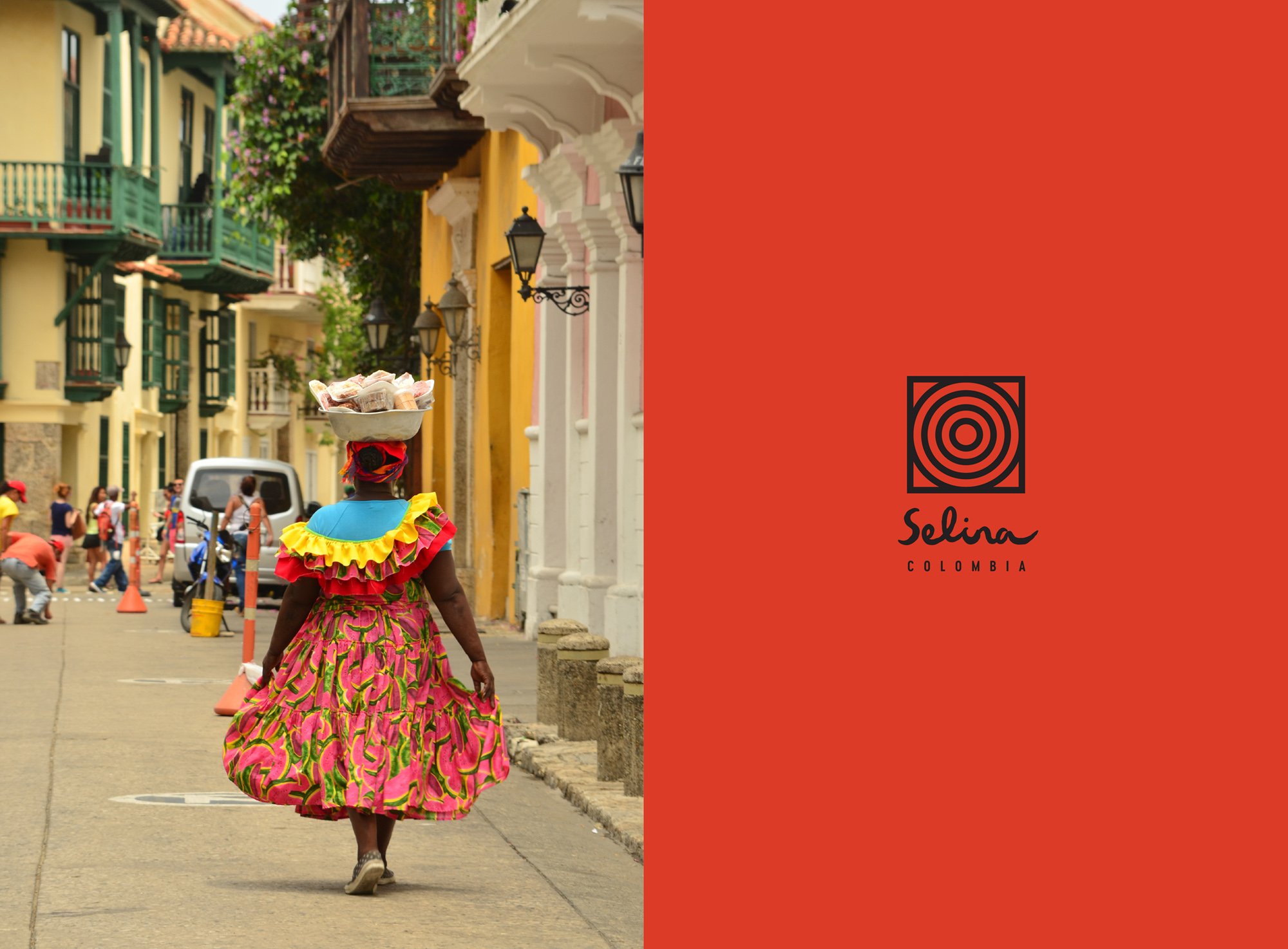


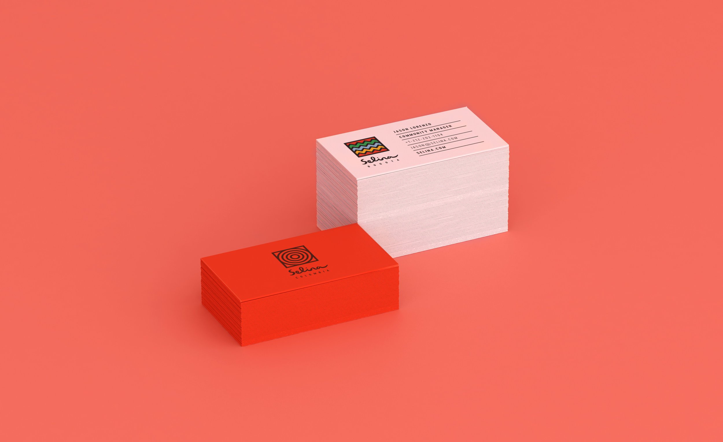



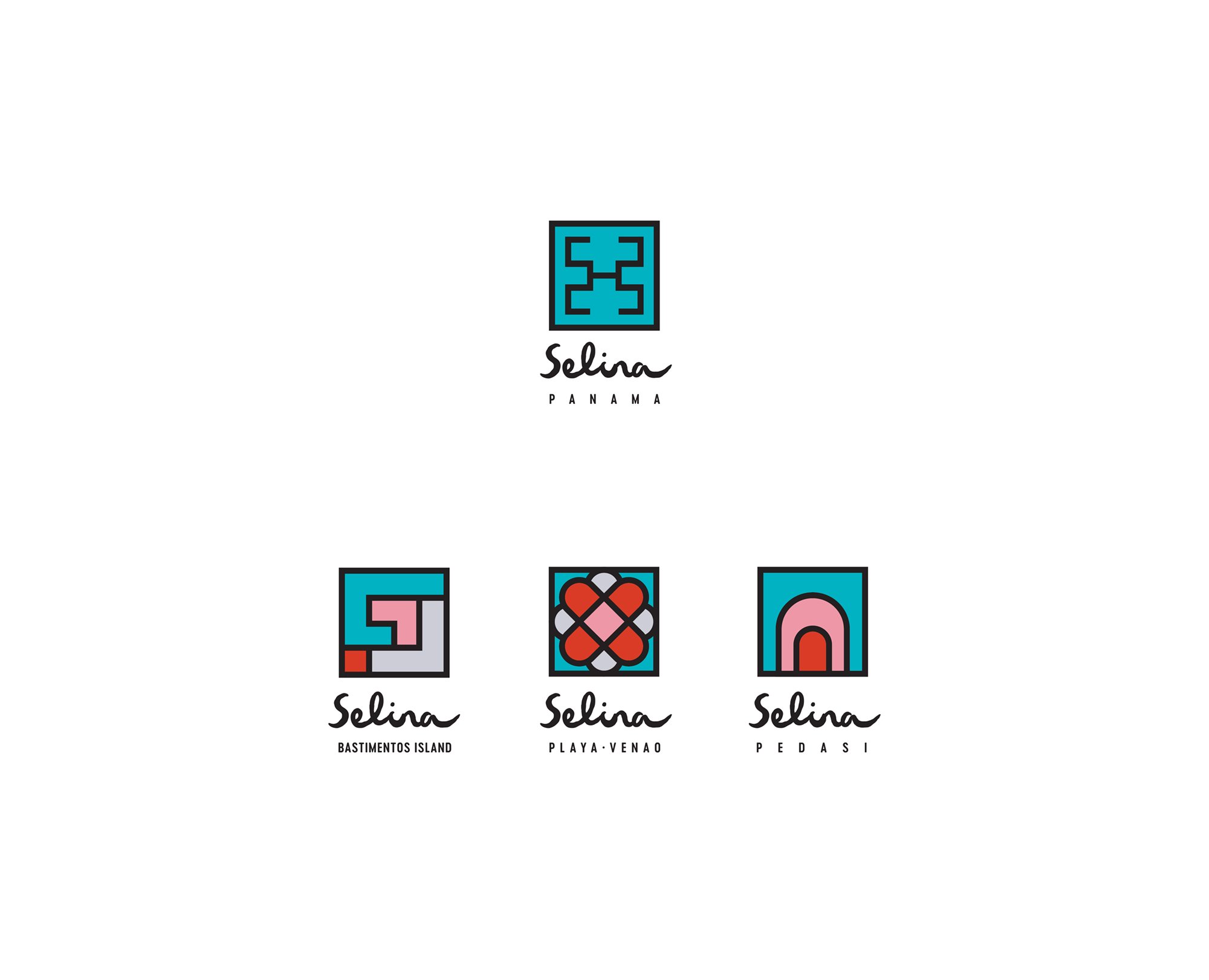
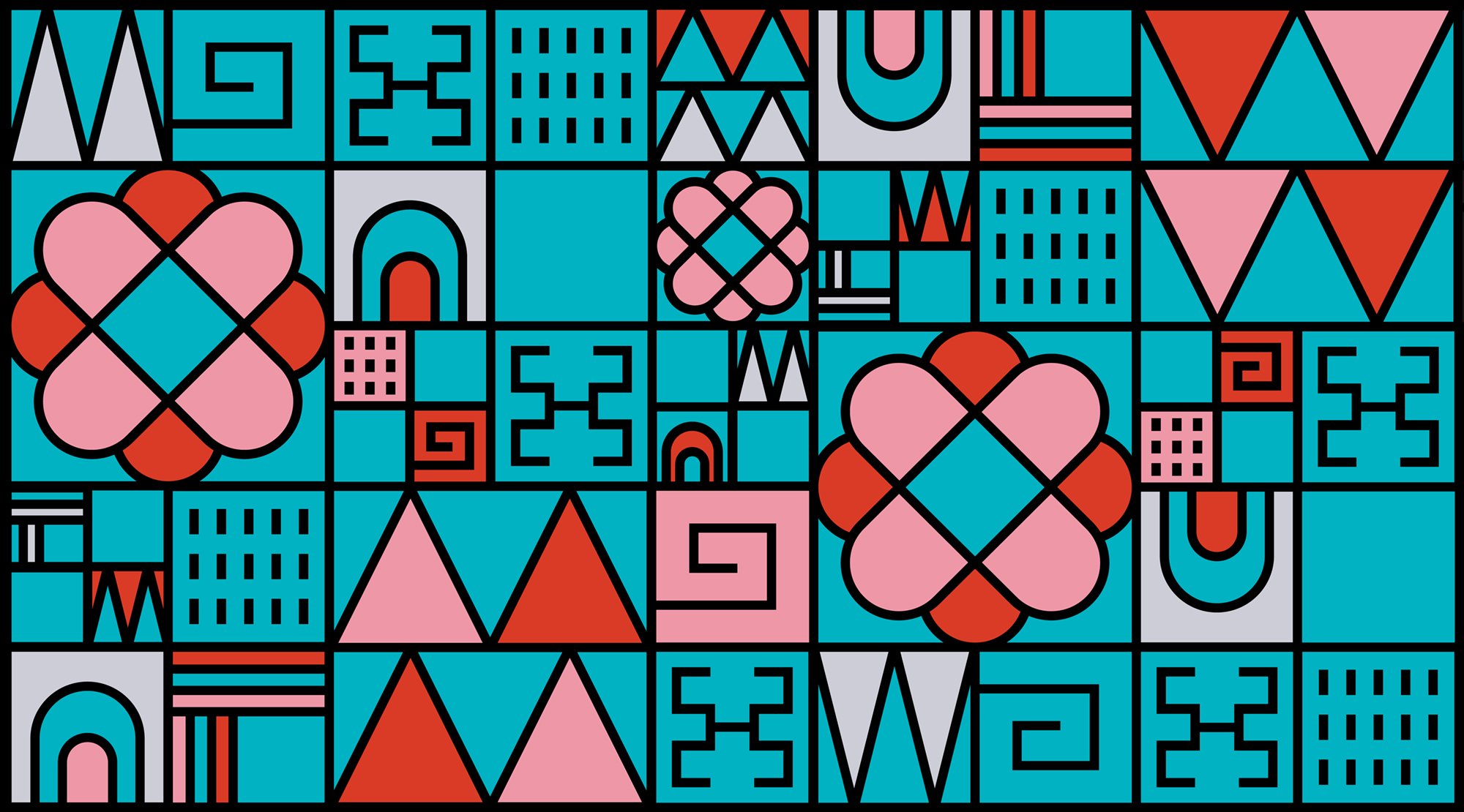
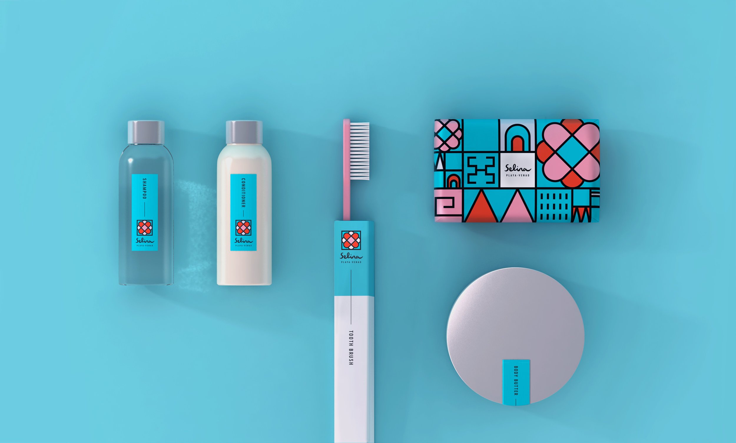

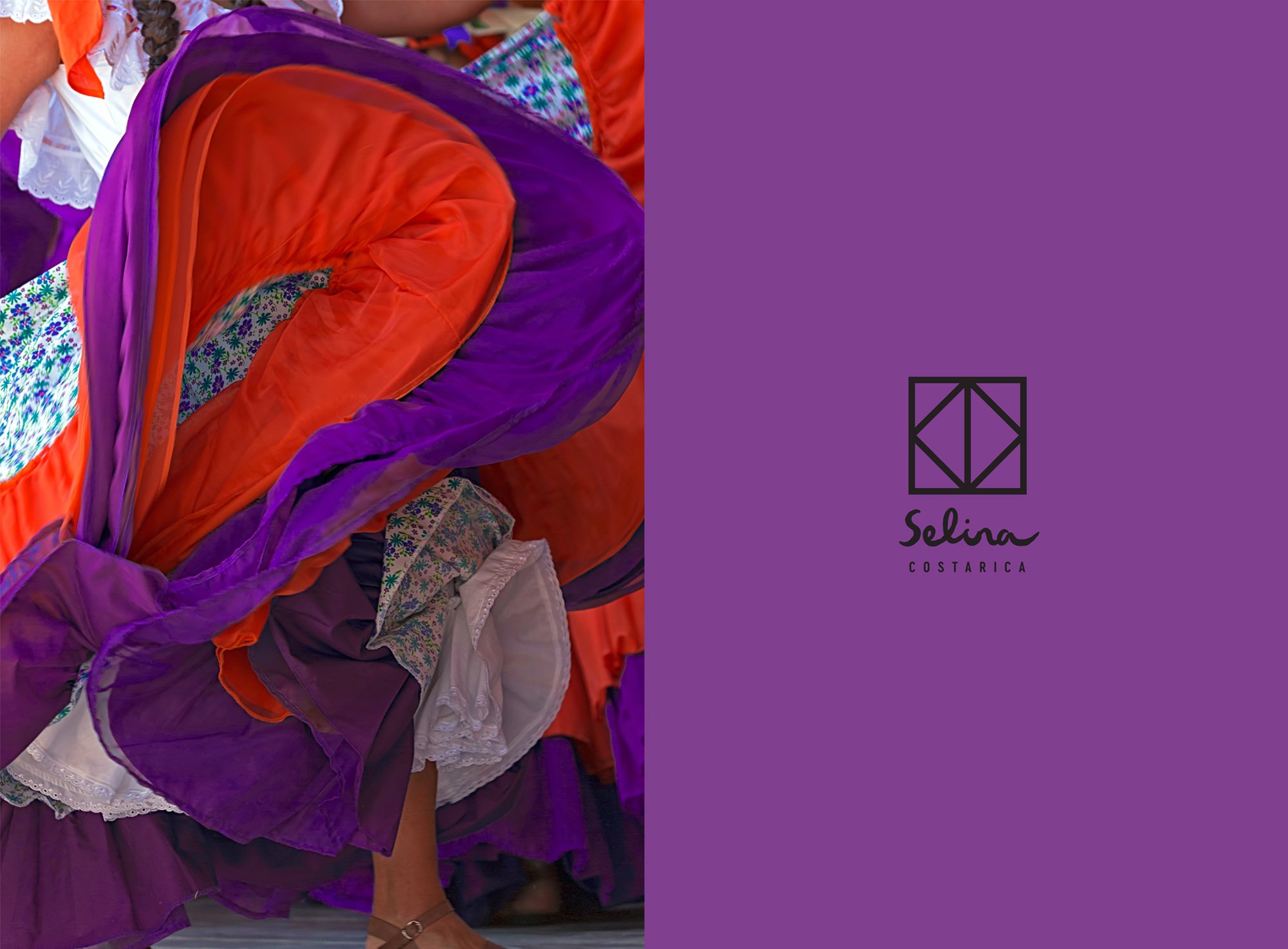

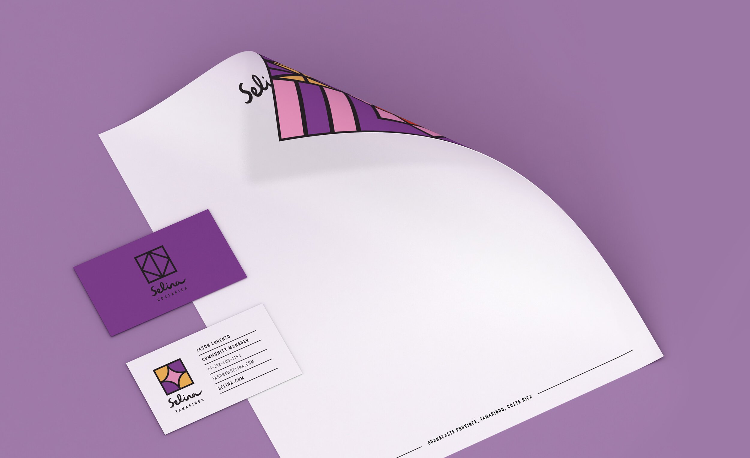
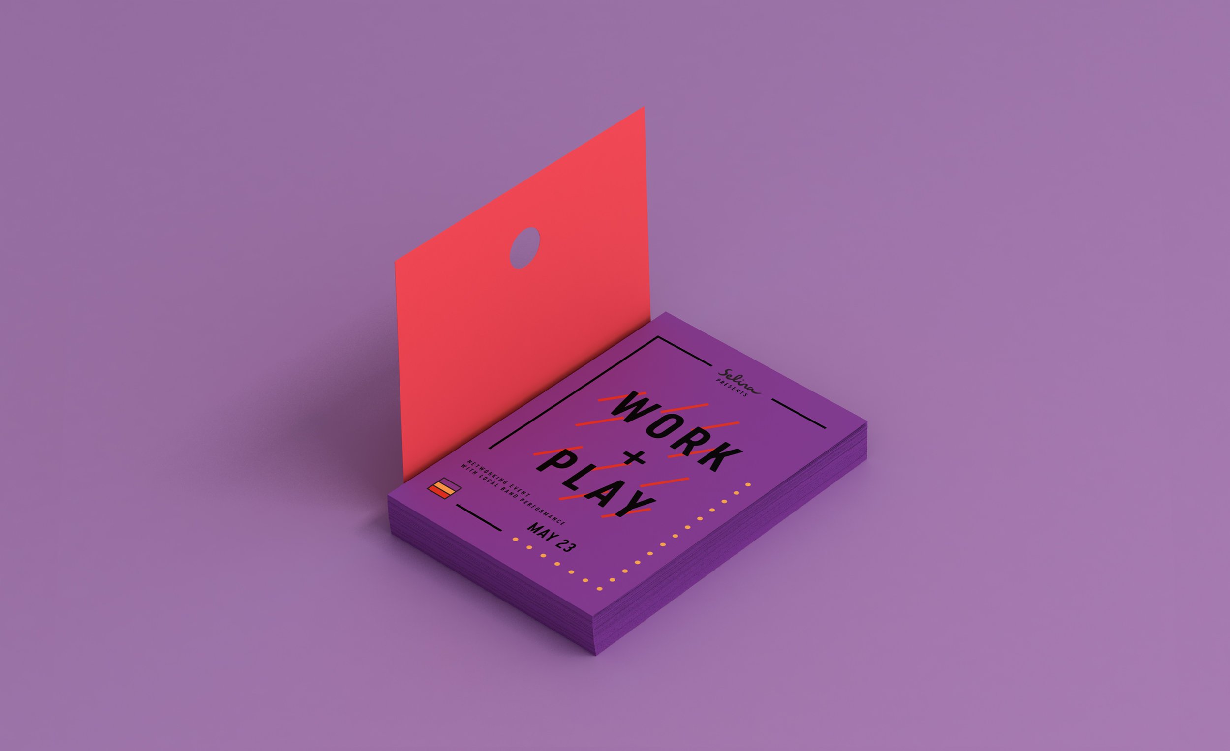
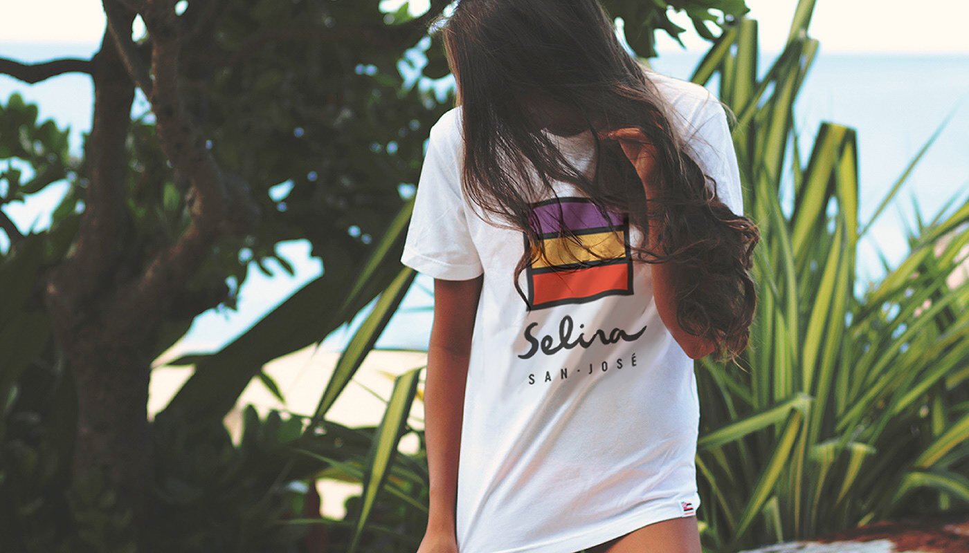
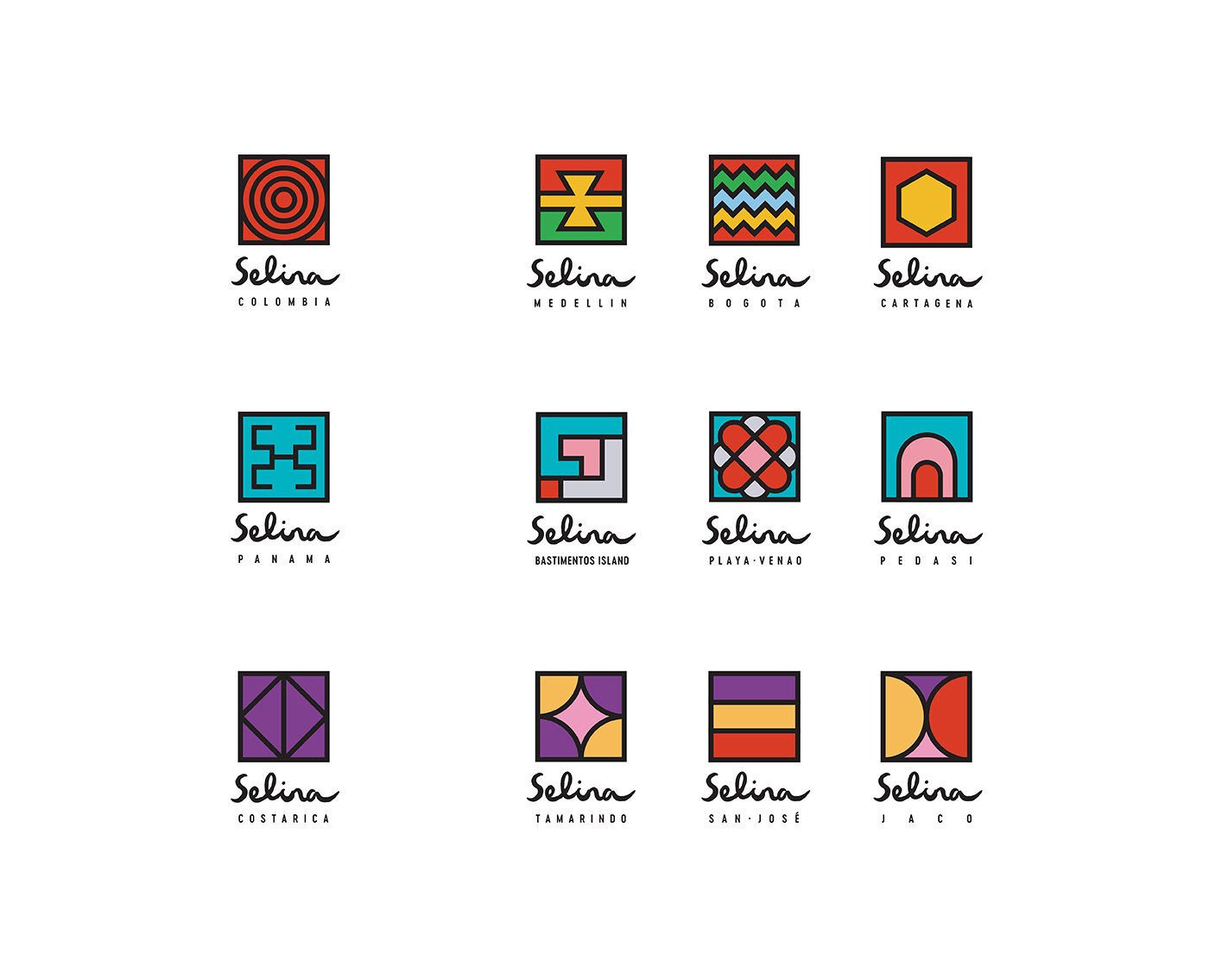

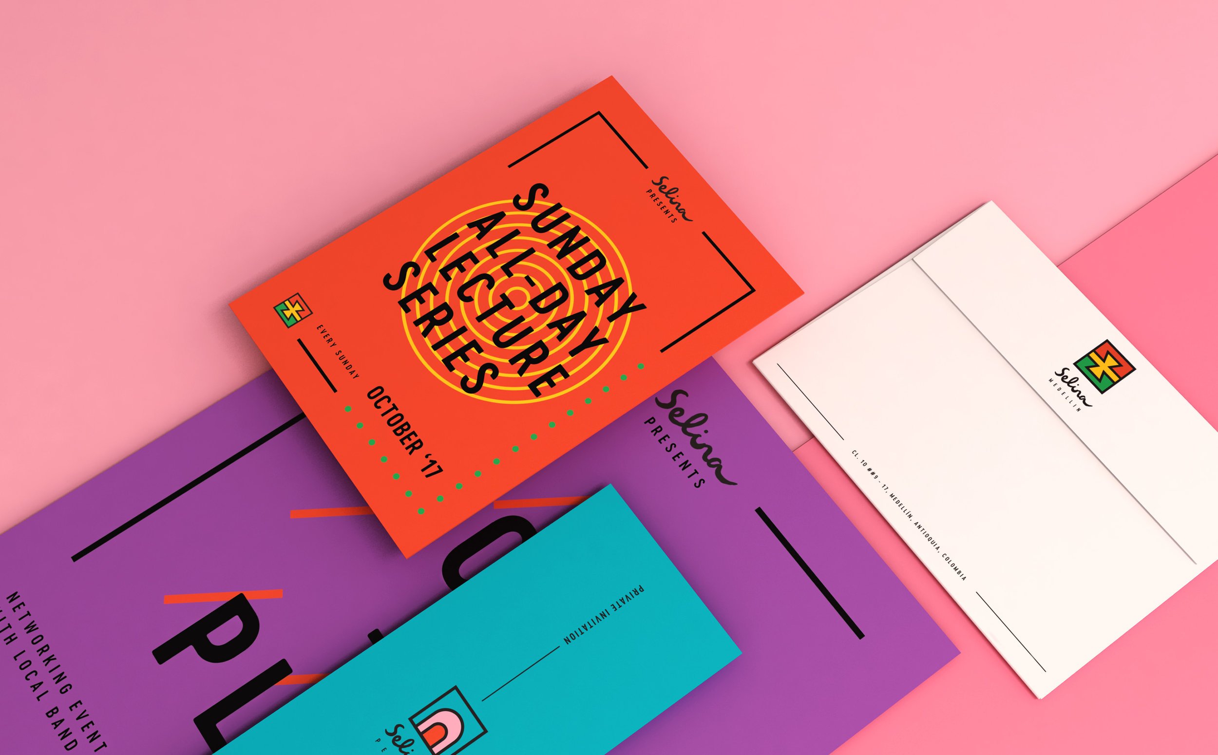

Selina’s identity creates a flexible hospitality system rooted in travel, culture, and community. Through illustration, pattern, color, and branded applications, the project helped shape a global brand that feels expressive, locally inspired, and built for a new way of moving through the world.