Chapter
Project Context
Chapter is a residential renovation brand created to make apartment and townhome renovations feel clearer, more modern, and easier to navigate. The brand was built around the idea of renovation as a life transition — a new home, a new routine, a new chapter.
Design Approach
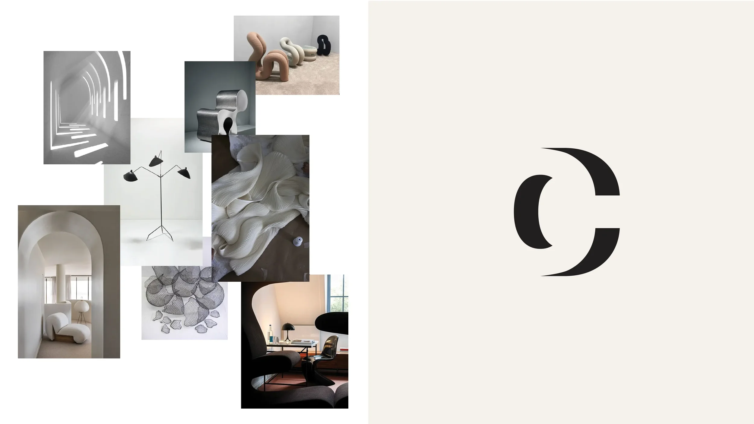
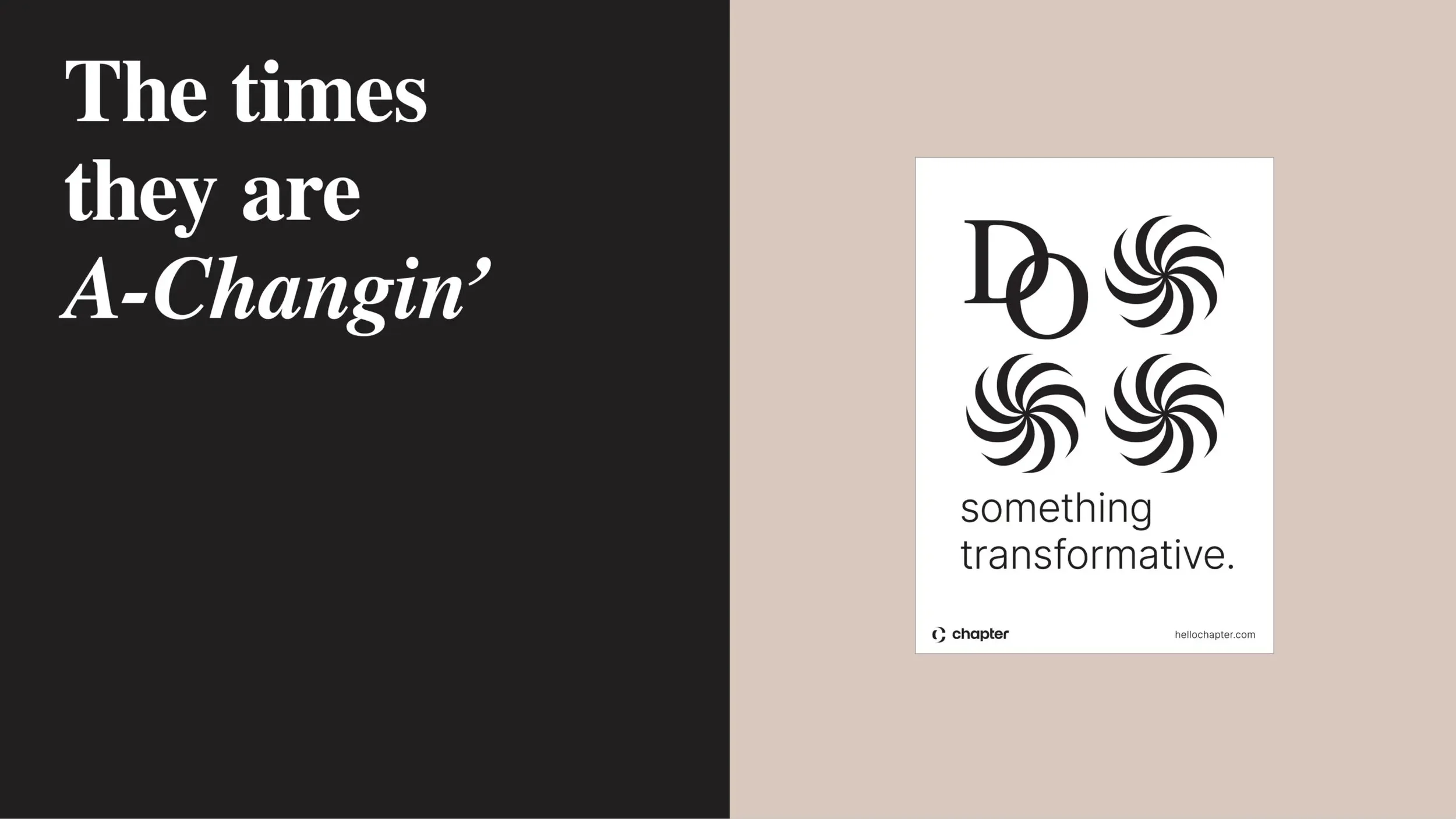
I created the brand identity system, translating the concept of time, transition, and new beginnings into a clean and flexible visual language. The logo system includes a wordmark and an icon formed from the shadow of the letter “C,” representing time passing and movement from one chapter into the next.
Brand Identity
Logo Design
Icon Design
Visual System


Logo System
The Chapter logo system includes a clean wordmark and a separate icon. Together, they create a flexible identity that can feel clear and professional in practical settings, while still carrying a more emotional idea around time, transition, and new beginnings.
Logo Icon
The Chapter icon is formed from the shadow of the letter “C.” The shadow represents time passing, echoing the idea of moving from one chapter of life into the next. It gives the identity a subtle sense of motion and transition without making the mark feel overly decorative.
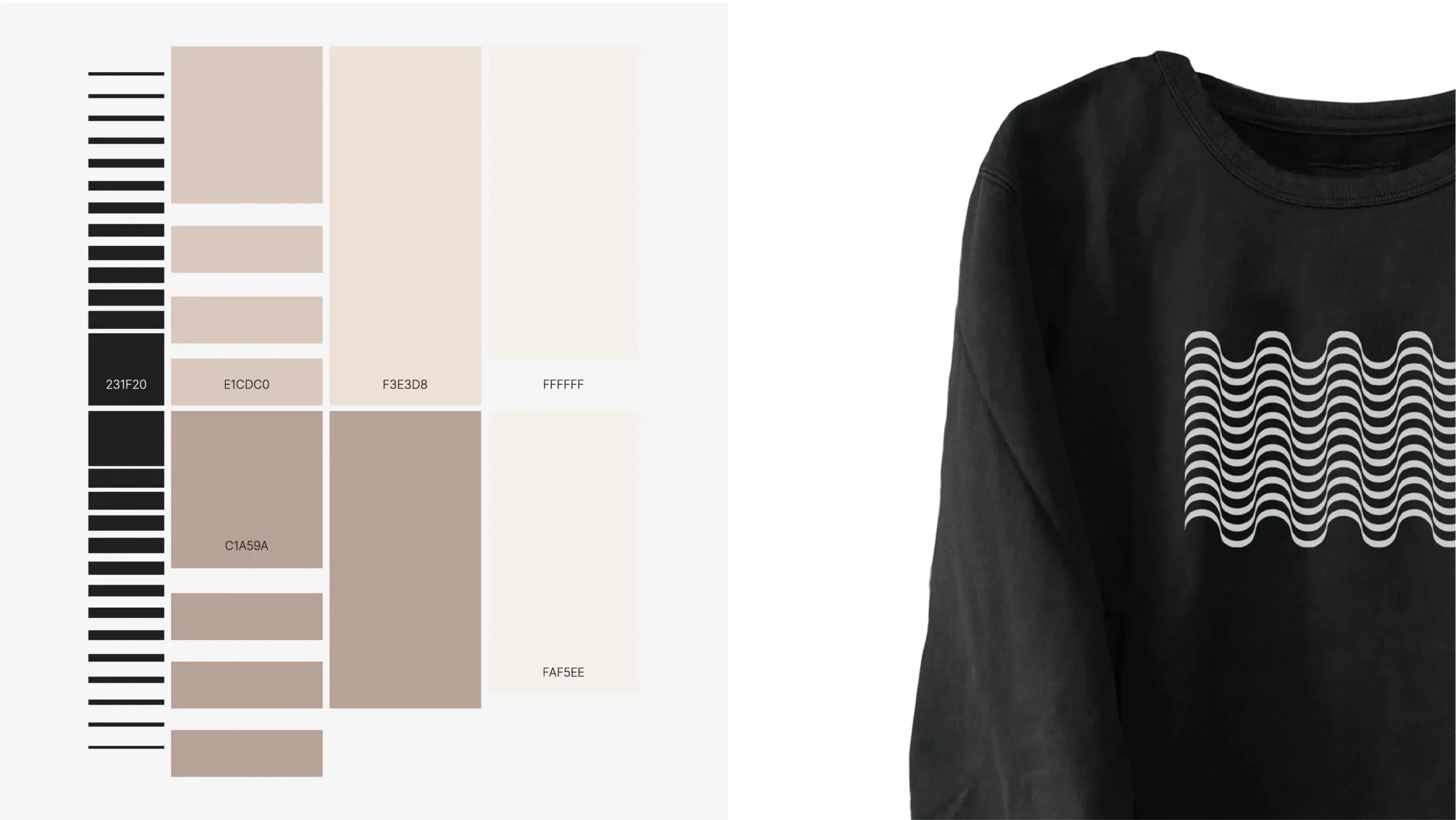
Visual System
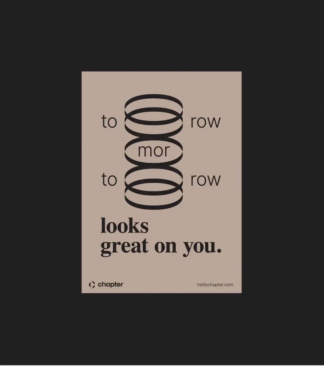
The visual system balances structure with warmth. Clean typography, open layouts, and approachable graphic details help the brand feel professional and reliable without becoming cold or overly corporate.
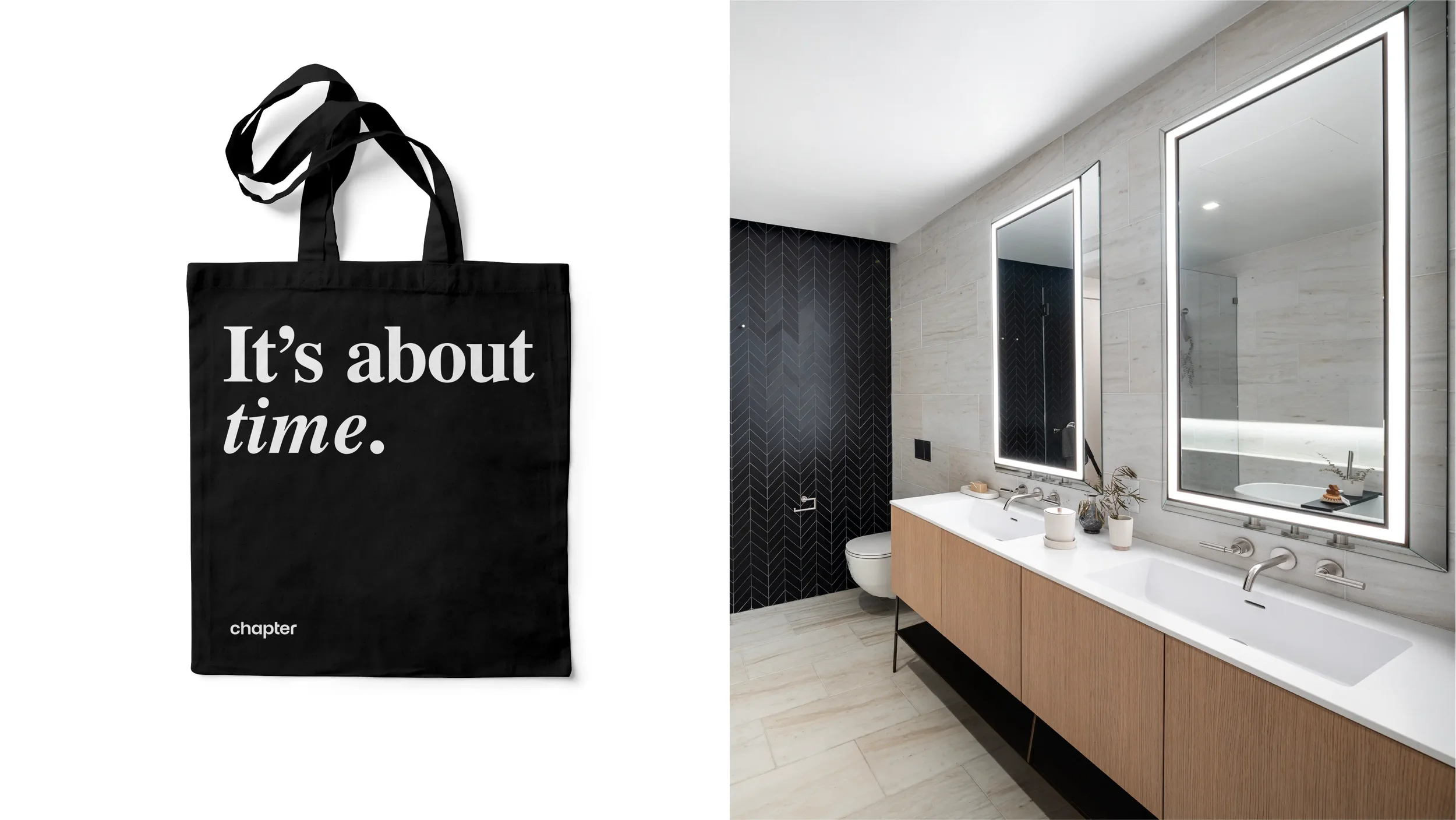
Brand Applications
The identity was extended across branded touchpoints to show how the logo system, icon, typography, and visual language could live beyond the core mark. These applications helped establish a cohesive and flexible brand world.
Through the brand identity, logo system, and visual applications, Chapter translates the idea of renovation as time, movement, and new beginnings into a clean and flexible visual language.