Pereg Quinoa Pops
Project Context
Pereg Quinoa Pops is a cereal line created for Pereg Natural Foods, a family-owned food company with roots dating back to 1906. The challenge was to introduce quinoa as a breakfast cereal in a way that felt approachable, playful, and easy to understand in a crowded cereal aisle.
Design Approach
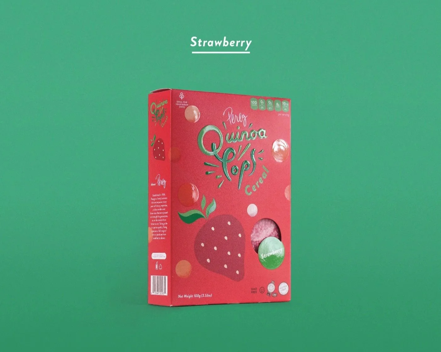
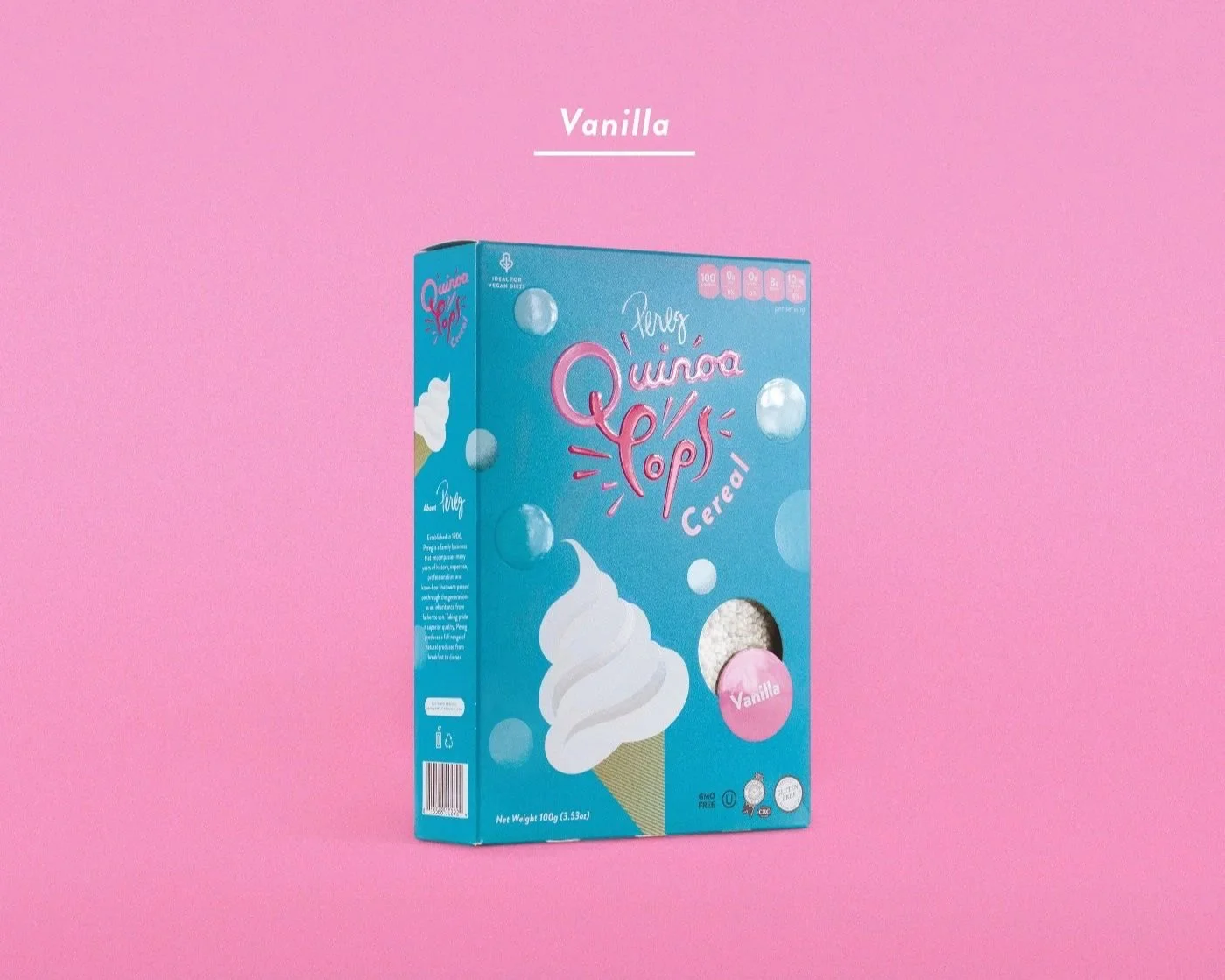
I developed a bold packaging direction that uses strong color, playful illustrations, and a clear box structure to help each flavor stand out on shelf. The “pop” of the quinoa is expressed through bubble-like graphics across the packaging, turning the product texture into a visual language that feels light, energetic, and easy to recognize.
Concept Development
Logo Refinement
Packaging Design
Illustration
Visual System
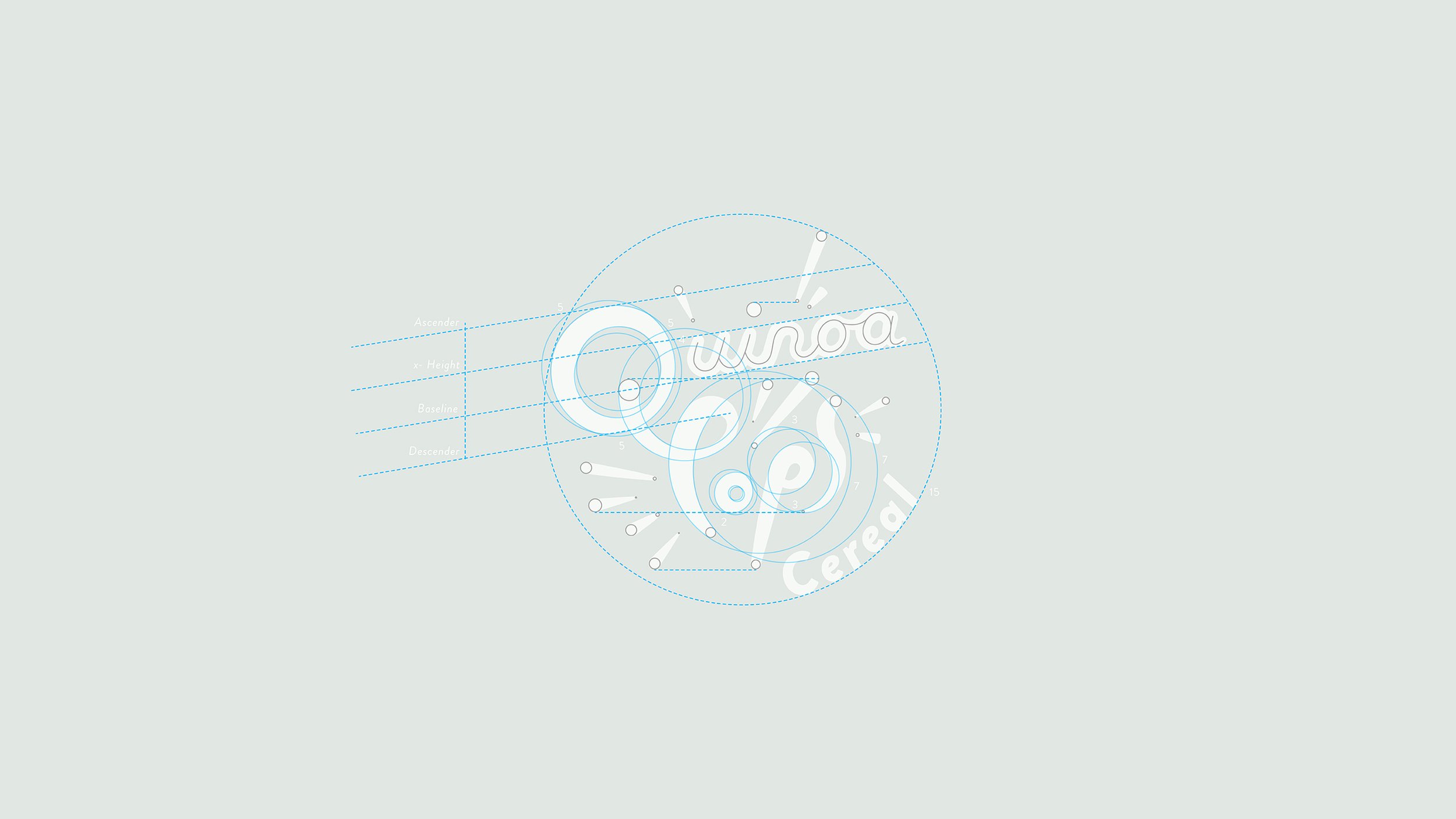
Logo Refinement
The Quinoa Pops logo was originally drawn by an illustrator, then refined to feel cleaner, more balanced, and more usable across the packaging system. The final mark keeps the playful hand-drawn quality of the original illustration while giving the product a stronger focal point on shelf.
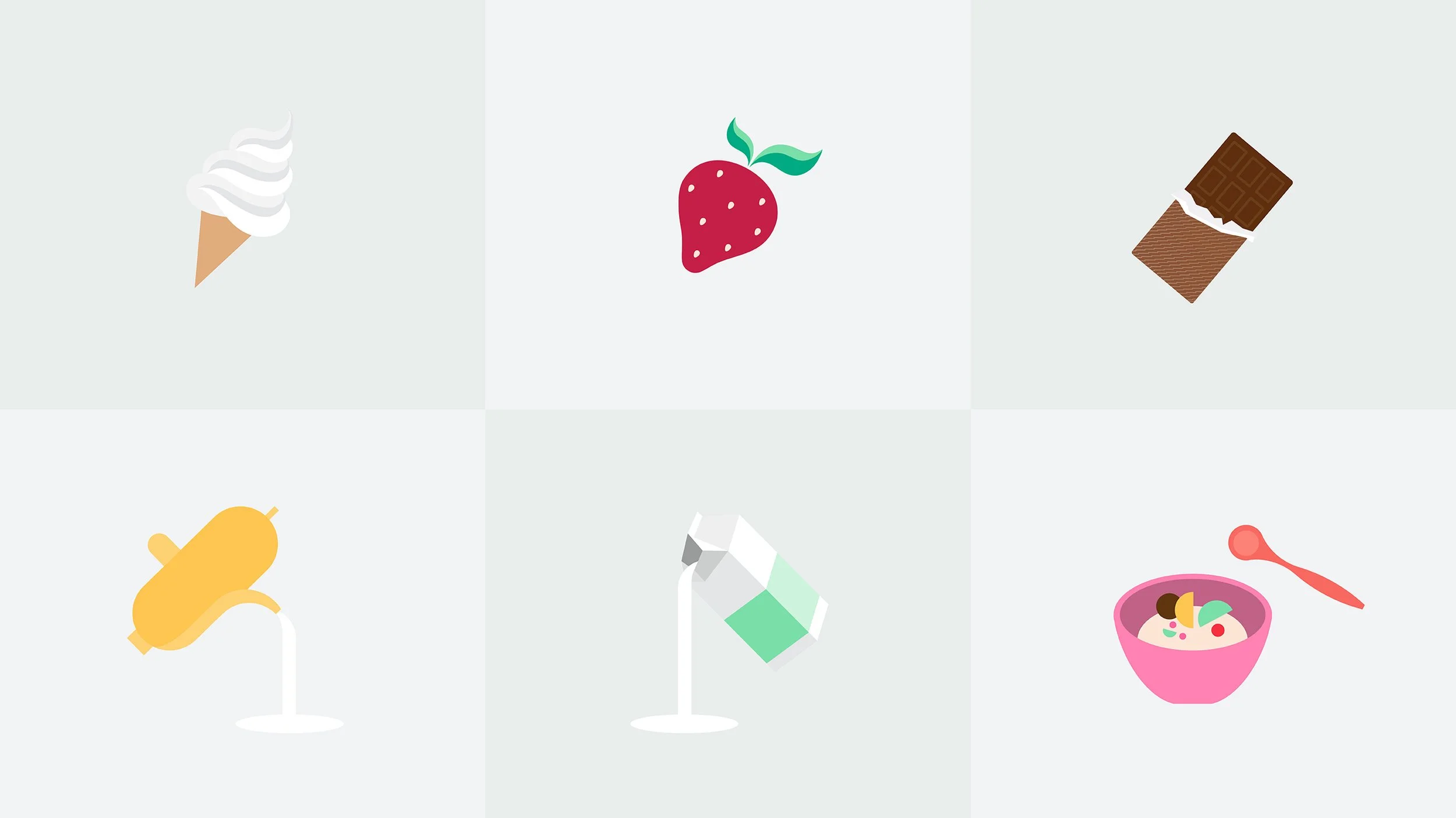
Illustration
The illustration system brings movement and personality to the packaging. I worked with playful illustrated elements to make the product feel more inviting, giving each flavor its own character while keeping the full line visually connected.
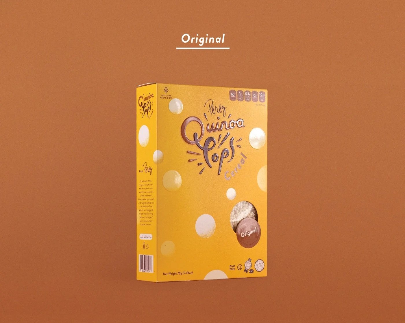
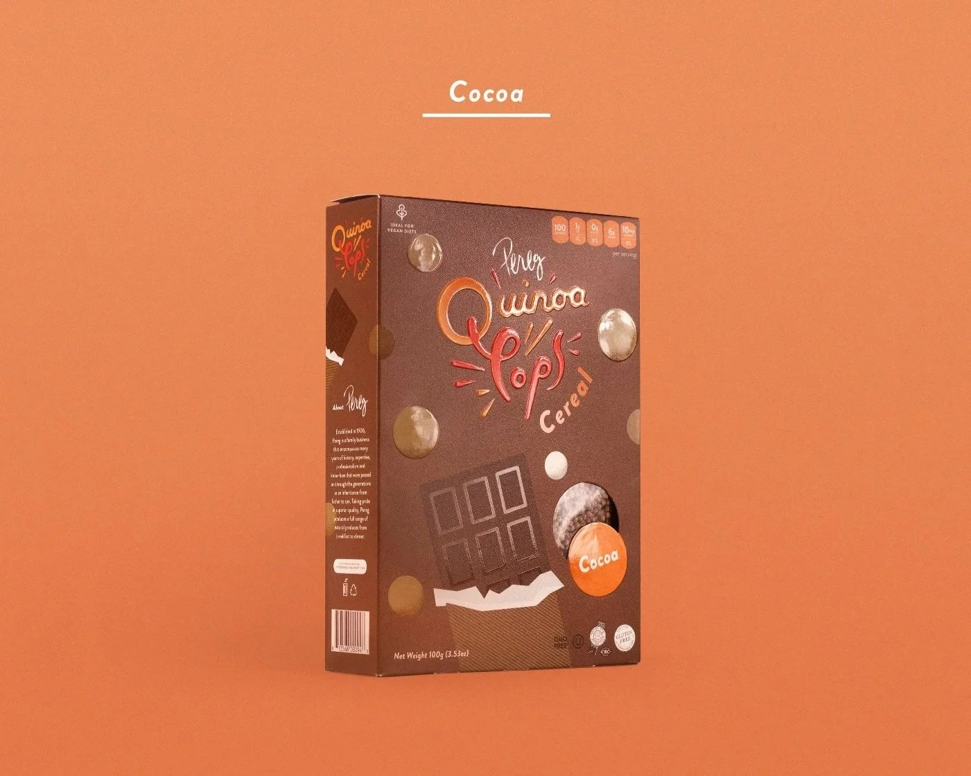
Packaging Structure
The box design uses a consistent structure across the line, with bold flavor colors and playful illustrations creating strong shelf presence. Bubble-like graphics represent the “pop” of the quinoa, giving the packaging a light, energetic visual language while helping the product feel fun and approachable.
Shelf Presence
The packaging was designed with strong shelf visibility in mind. Bold colors help each flavor stand apart, while playful illustrations and bubble-like graphics create a clear visual cue for the “pop” of the quinoa. The result is a cereal line that feels bright, approachable, and easy to recognize in a crowded retail environment.