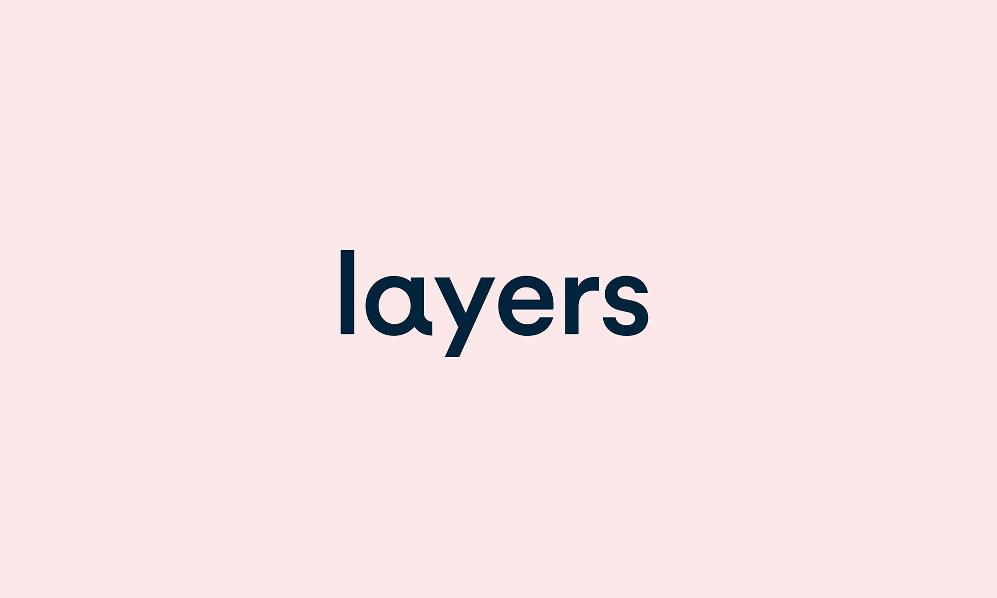
Layers
Layers is a new type of rental property – one built on flexibility, resident diversity and community creation. The brand identity seamlessly embodies the brand's philosophy of versatile living solutions and robust community engagement. Aligned with the desire for various lifestyles and a community of kindred spirits, the name Layers symbolizes the convergence of diverse personas, forming a collective strength greater than any individual.
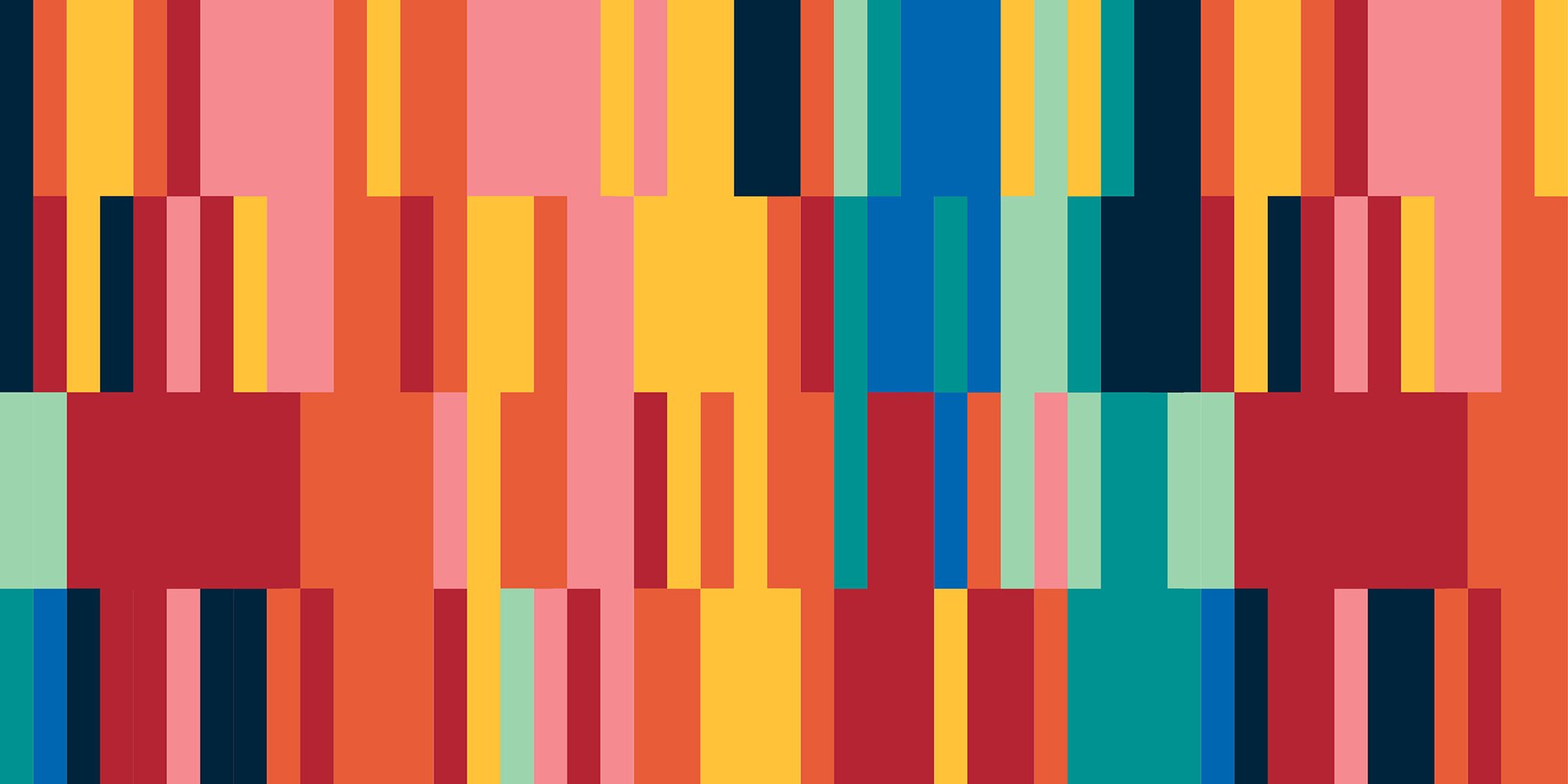
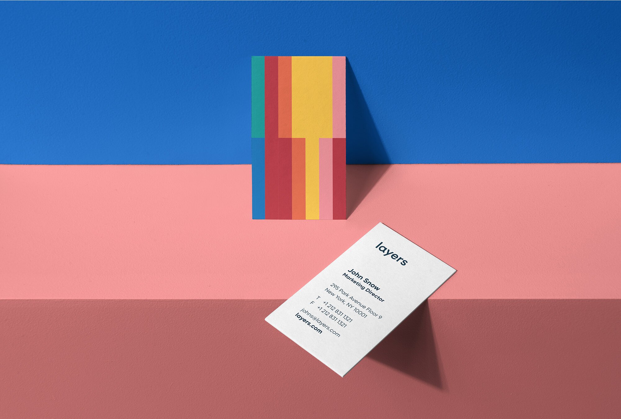
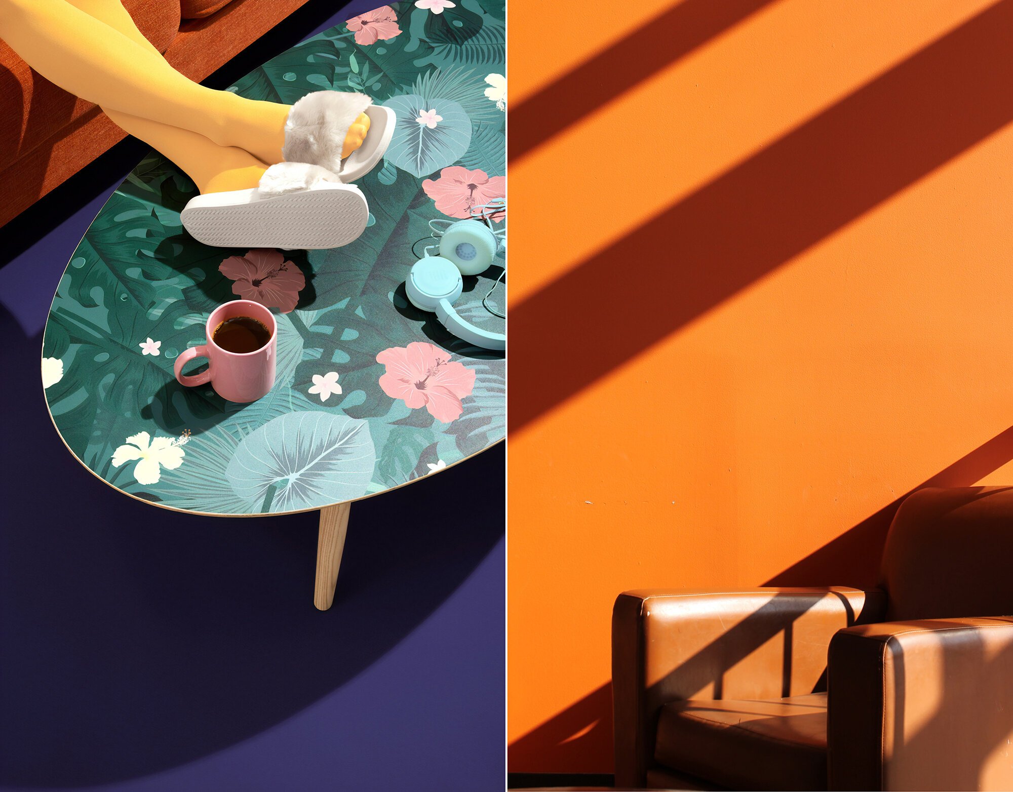
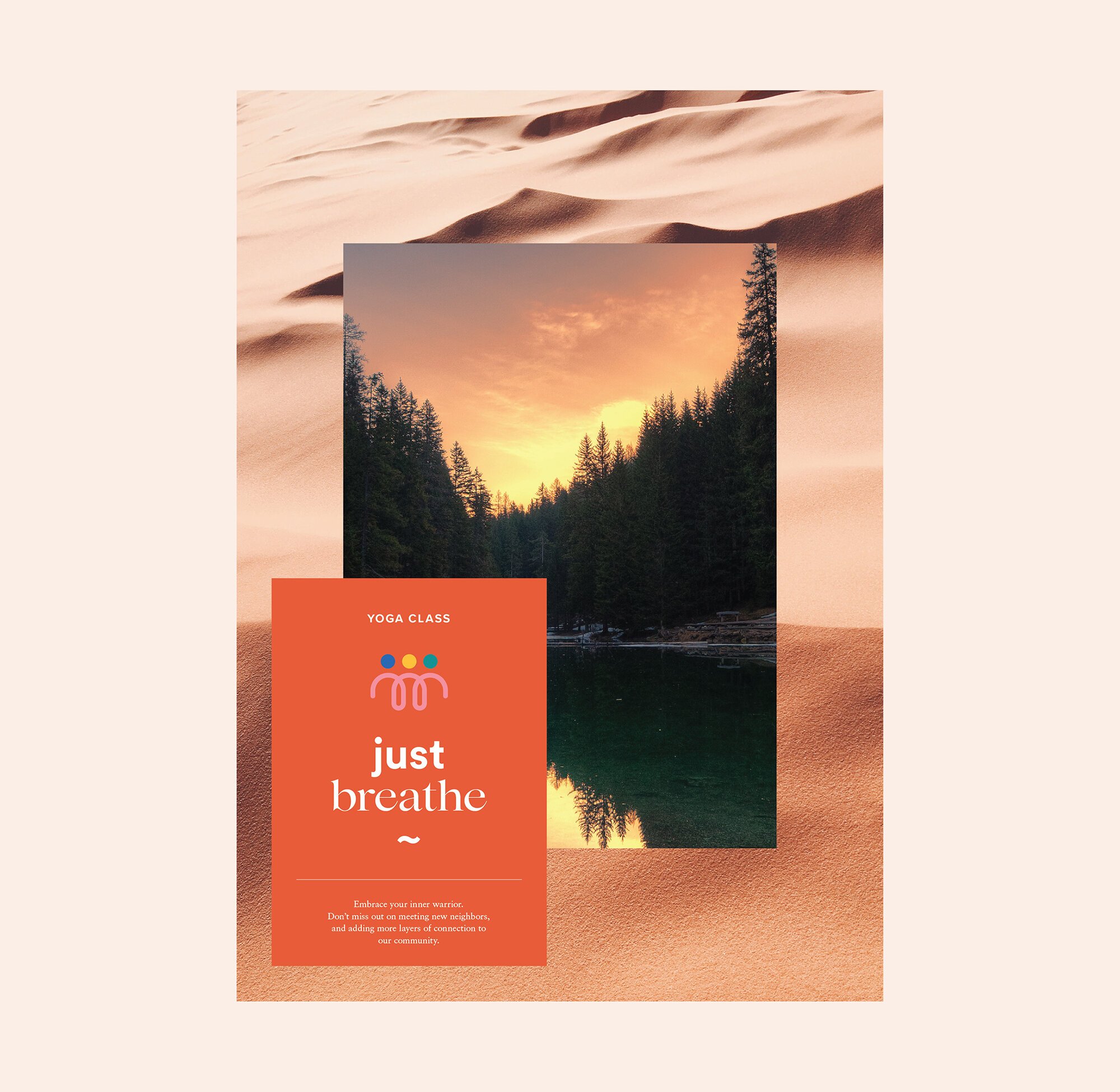
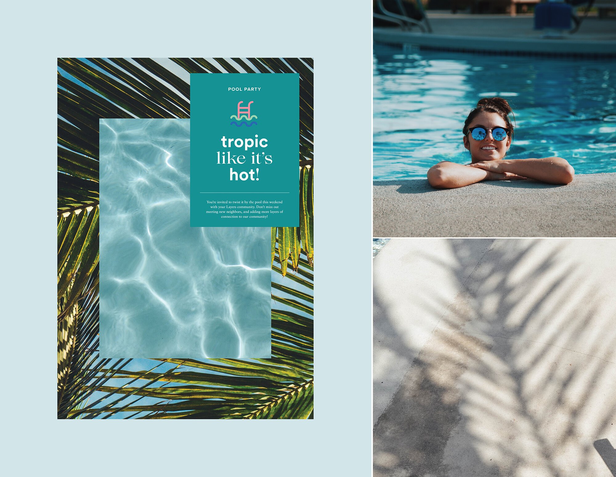
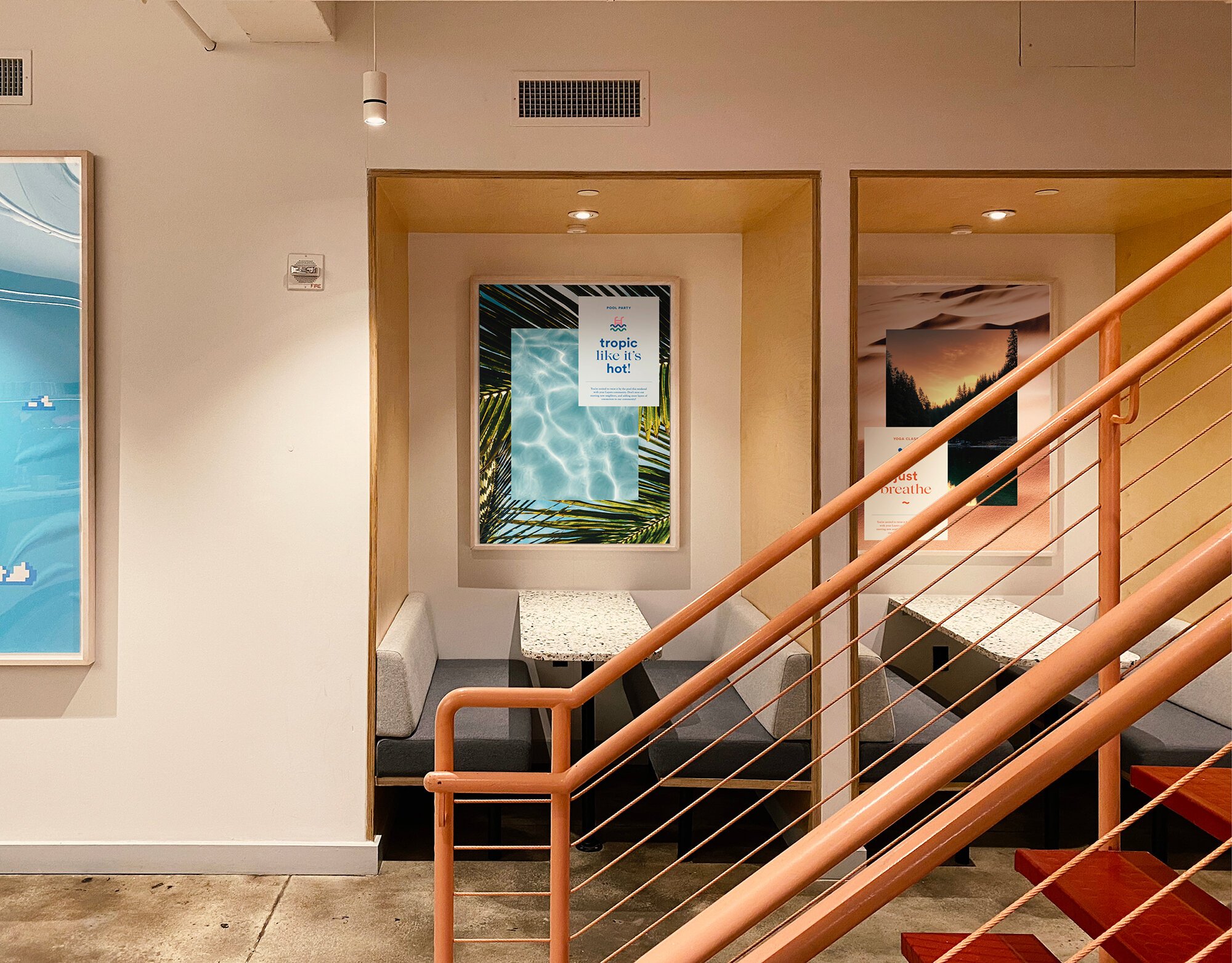
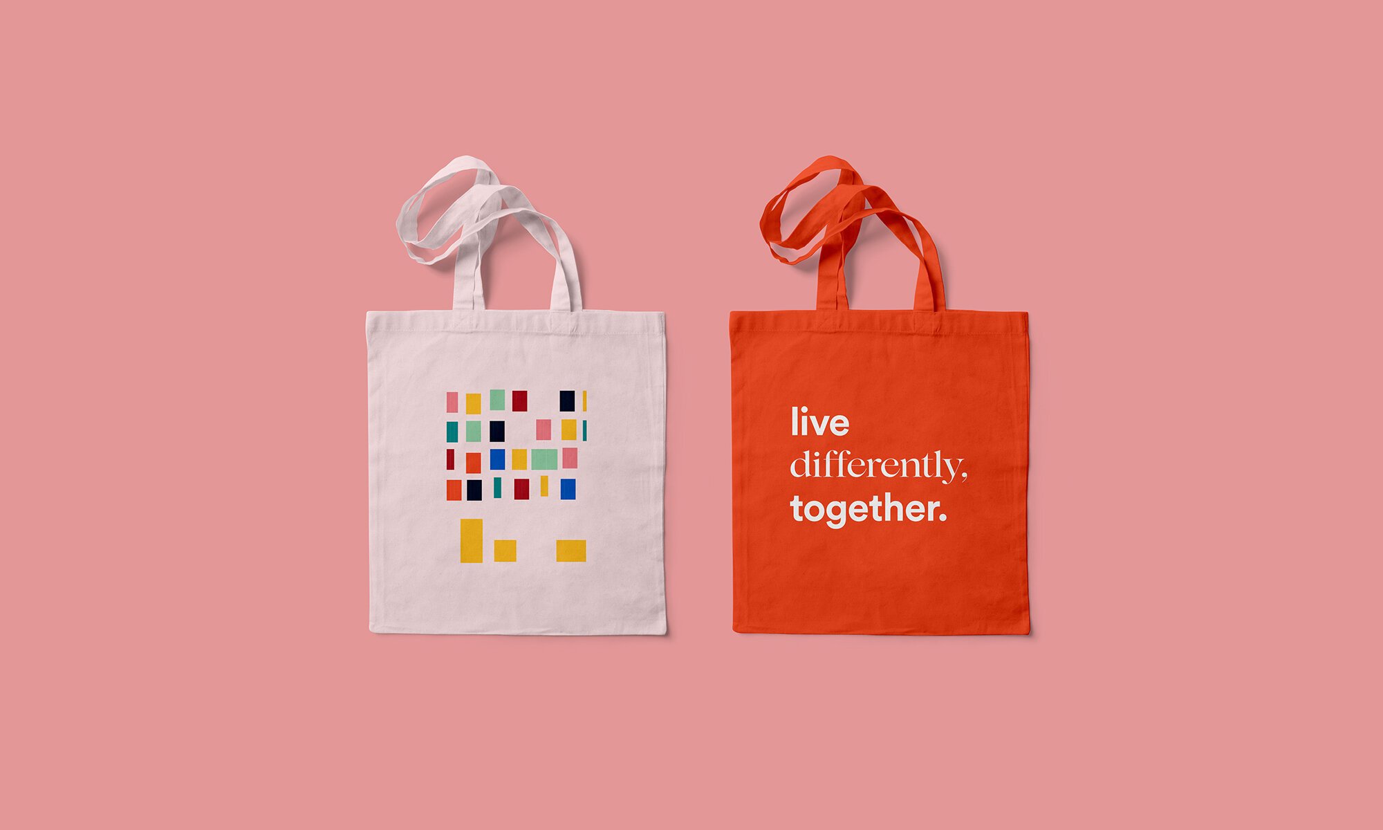
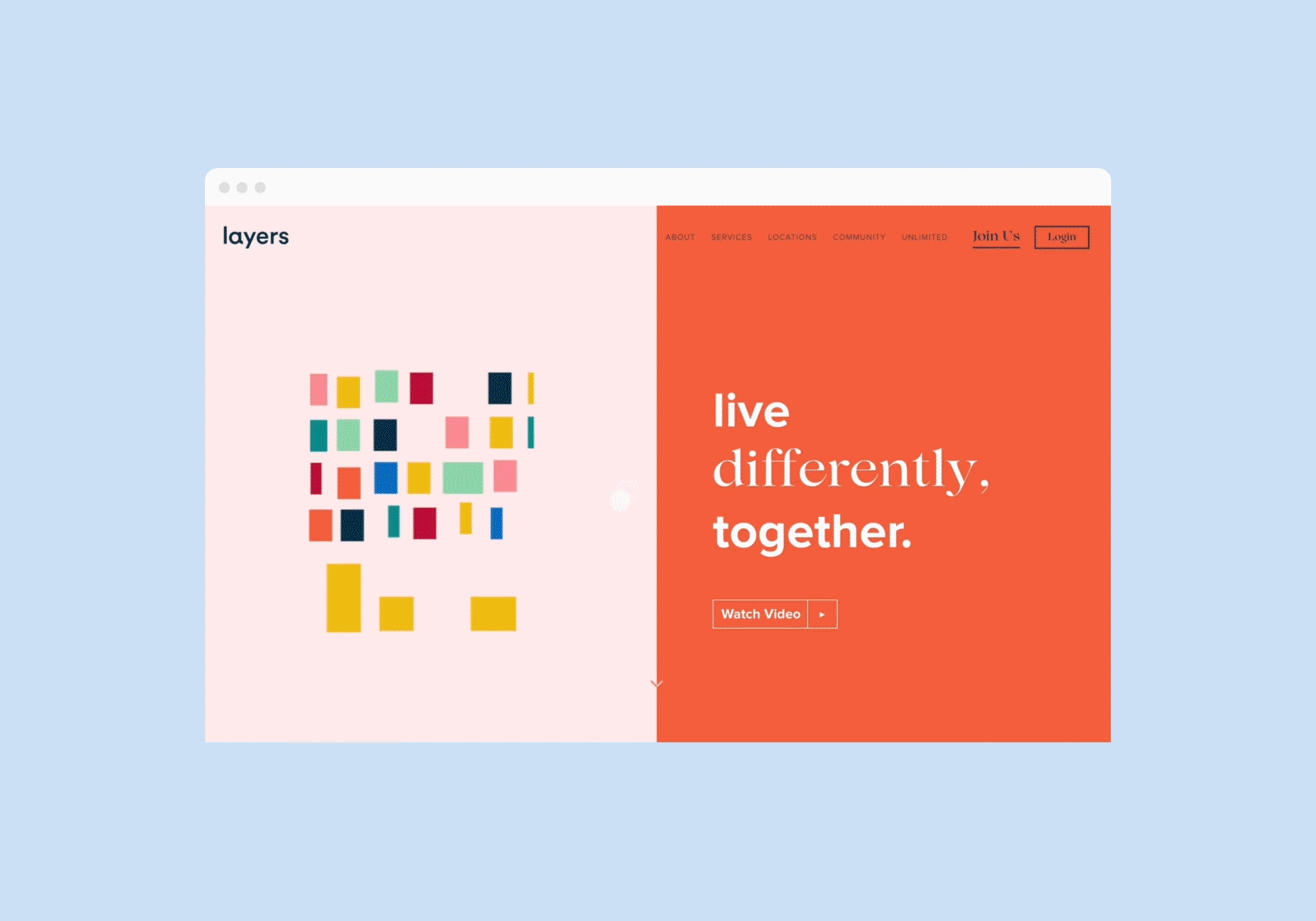
Visually, this concept comes to life through a dynamic and diverse color palette, mirroring the vibrant tapestry of the community. The lowercase "l" shape in the logo ingeniously constructs a captivating pattern, resembling building blocks that symbolize the interconnected nature of the Layers community.
2019
Art Direction, Concept Development, Brand Identity, Logo, Posters, Website Design