Plus Therapeutics
Project Context
Plus Therapeutics is a clinical-stage biopharmaceutical company developing targeted radiotherapeutics for rare and difficult-to-treat cancers. The digital experience needed to communicate complex medical innovation with greater clarity, warmth, and emotional resonance.
Design Approach
Using the plus symbol from the company logo as a starting point, I expanded the mark into a larger concept around “adding” value. The visual direction connects the science to what Plus can add to people’s lives: more time, more closeness, more play, and more possibility.
Concept Development
Art Direction
Website Design
Visual Storytelling
Iconography

Logo Symbol as Concept
The plus symbol was taken from the company logo and expanded into a visual and conceptual system. Throughout the website, it acts as a symbol of addition — adding hope, adding time, adding moments, and adding value to patients’ lives.
Human Moments
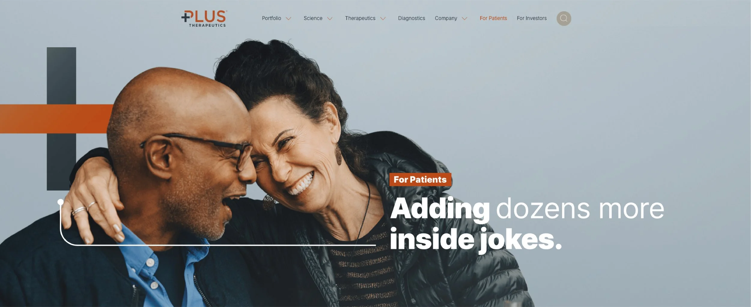
The imagery focuses on small, meaningful moments — a hug, a playdate, time with family. These scenes help make the science feel more tangible, showing what medical progress can add to everyday life.
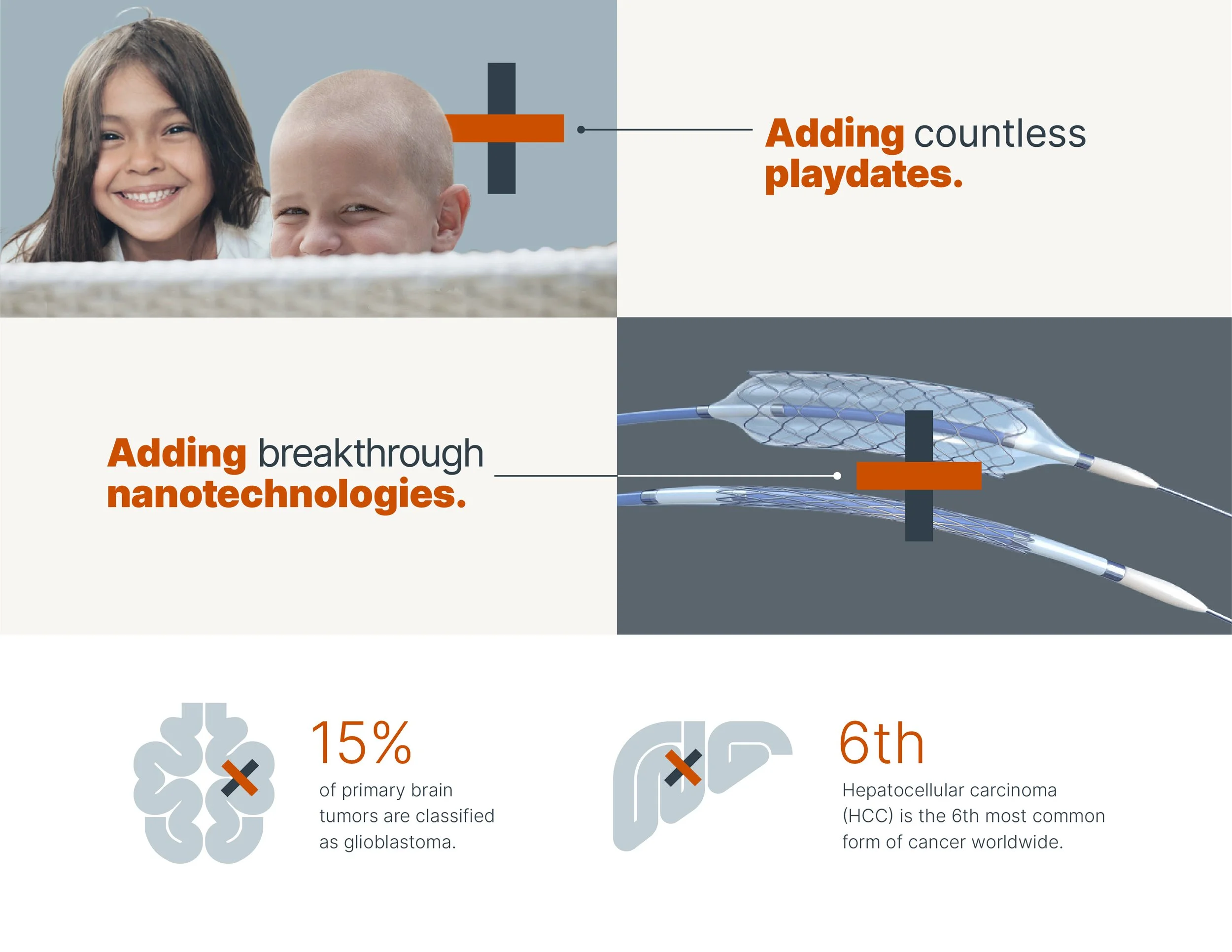
Plus Symbol Integration
The plus symbol appears throughout the site as a recurring graphic device. It is used within compositions, image treatments, icons, and page moments to connect the company’s identity back to the larger idea of addition.
Photography Direction
The photography direction brings warmth and humanity into a highly technical category. Natural light, intimate gestures, and emotionally familiar scenes help balance scientific credibility with compassion.

Icons & Illustrations
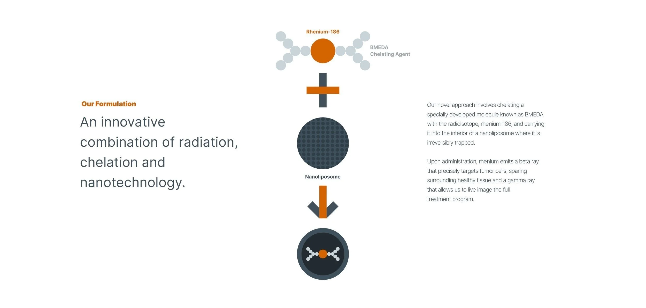
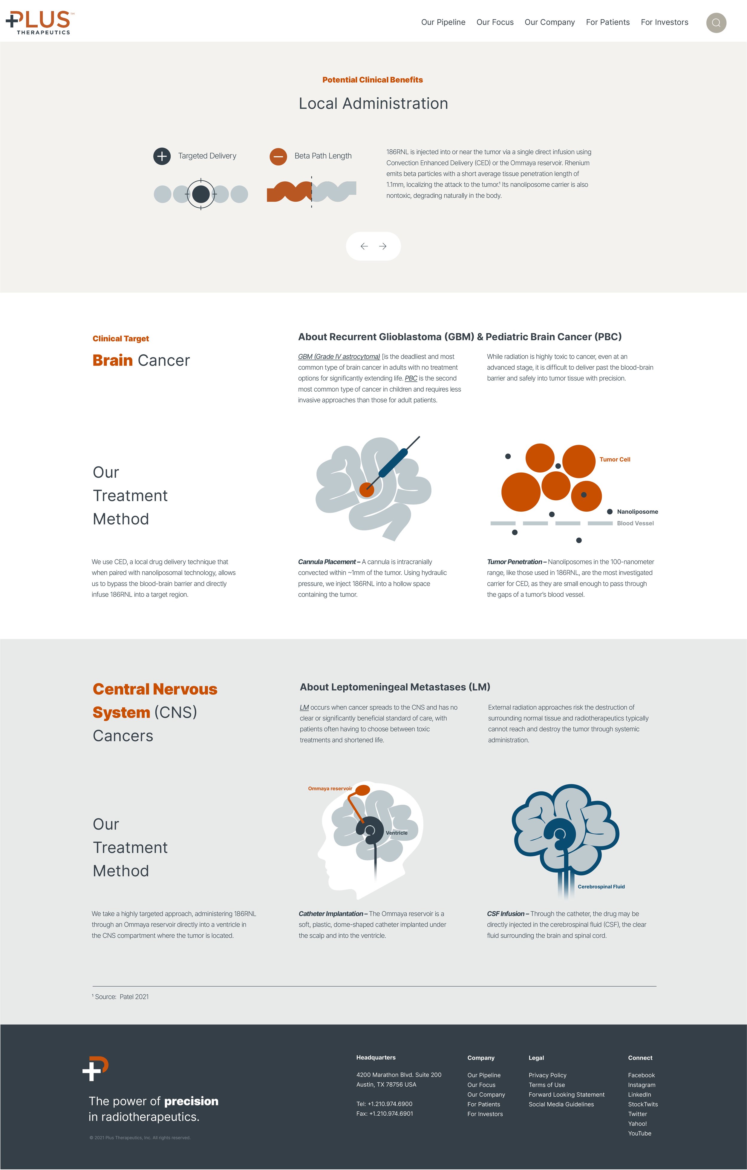
I created a custom icon and illustration system using Plus Therapeutics’ existing brand colors. The visuals helped translate technical and scientific information into a clearer, more approachable language while adding warmth to the digital experience without moving away from the established brand identity.
Medical Technology
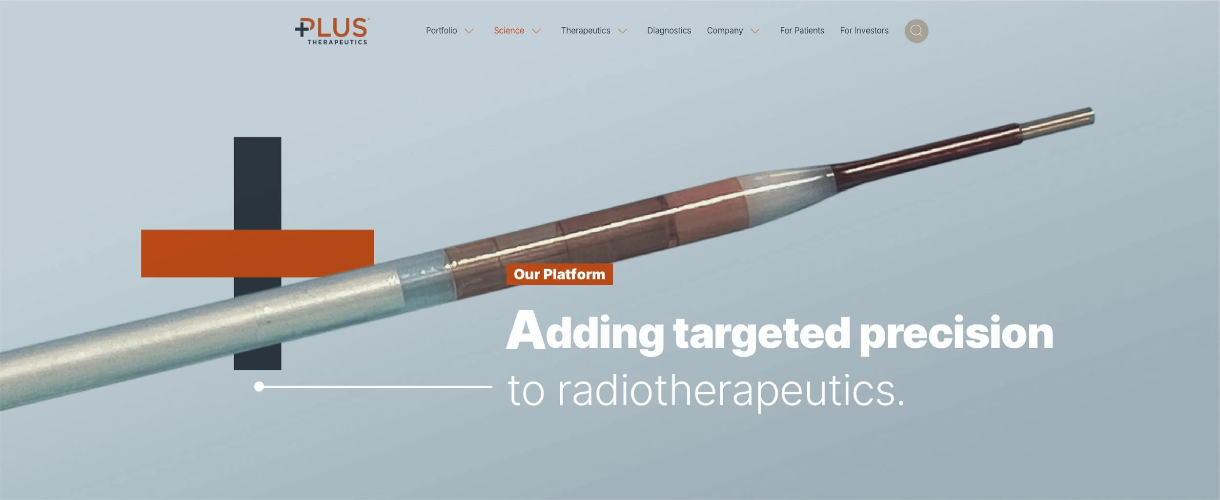
The technology imagery grounds the brand in real scientific advancement. By pairing medical visuals with the plus system, the design connects the company’s targeted radiotherapeutics to a broader story of patient impact.

Website Design
The website was designed to make complex information easier to navigate. Clear layouts, warm imagery, and intentional use of the plus symbol help guide users through the company’s science, pipeline, and purpose.
Iconography
The icon system translates technical and scientific information into a cleaner visual language. Each icon was designed to support clarity while staying consistent with the larger plus-driven visual system.
Plus Therapeutics turns the company’s plus symbol into a broader story of what medical innovation can add. Through concept development, art direction, website design, and iconography, the project connects targeted radiotherapeutics to the time, care, and human moments they may help make possible.