byAVA
Project Context
byAVA is an inner-beauty brand founded by Ava Lee, rooted in Korean wellness rituals, skin health, and beauty from within. As the brand expanded across boosters, elixirs, sculptors, and digital touchpoints, the existing identity needed a complete visual facelift.
Design Approach
I rebuilt the look and feel of byAVA while preserving the personal brand equity that made it recognizable from the beginning. The previous logo had sharper angles that felt too rigid for a wellness brand, so I redesigned it with a smoother, more flowing structure. Ava Pink remained at the center of the system, supported by a new icon, a more flexible color system, category-based palettes, packaging applications, and community marks that could support the brand’s next stage of growth.
Brand Facelift
Rebrand
Brand Identity
Logo Design
Icon Design
Illustration
Color System
Packaging
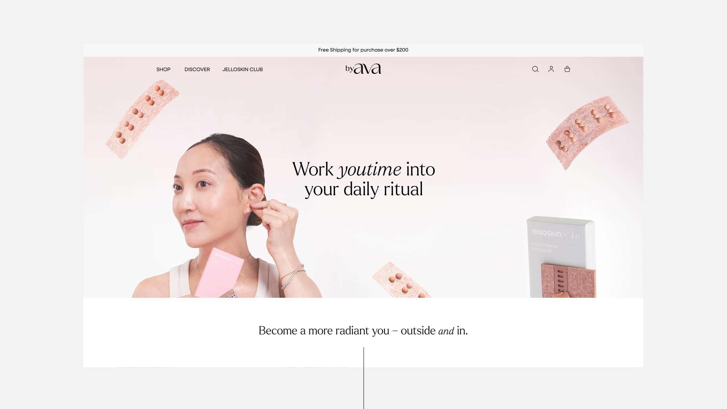
Website Direction
Brand Guidelines
Logo Redesign
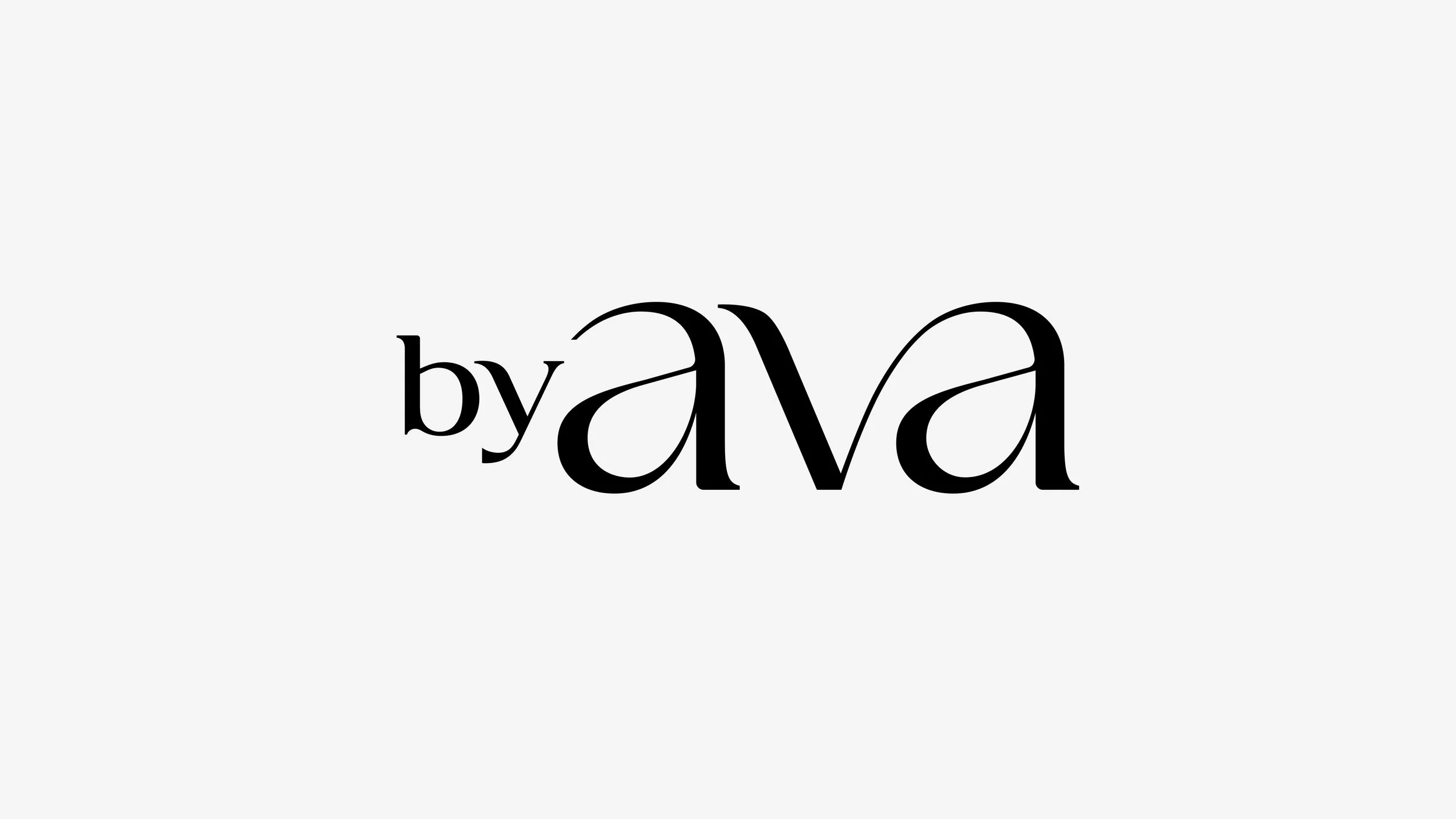
The previous byAVA logo had sharper angles and corners that didn’t fully align with the softness of a wellness and inner-beauty brand. I redesigned the logo with a smoother, more flowing structure, creating a wordmark that feels gentler, more balanced, and more connected to the brand’s focus on skin health, ritual, and beauty from within.
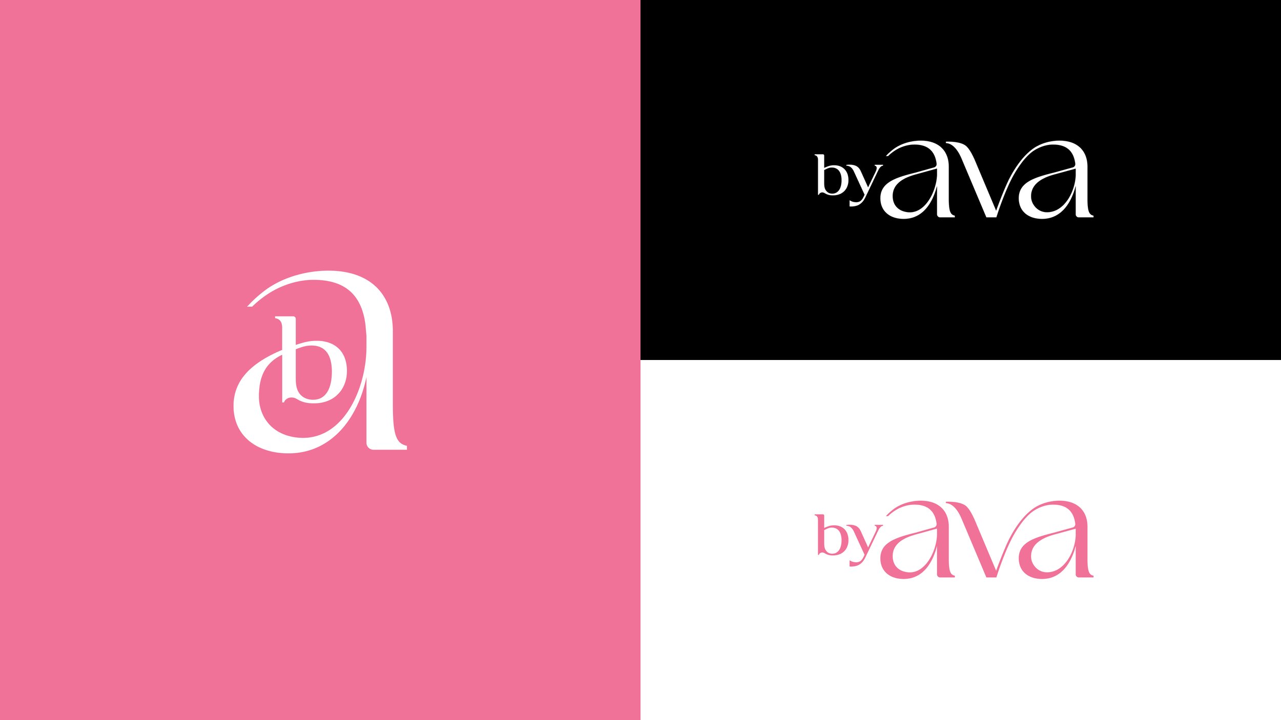
Logo Icon: Inner b + Outer a
The byAVA icon was built from the relationship between the inner “b” and the outer “a.” The “b” sits within the “a,” creating a simple visual metaphor for byAVA’s philosophy: inner beauty shaping outer beauty. The mark turns the brand’s belief — that skin health begins from within — into a quiet, ownable symbol.
Color System
Color became one of the most important parts of the facelift. Each shade was named and assigned with intention, creating a system that could support the brand emotionally, functionally, and commercially across different product categories.
Ava Pink
Ava Pink defines byAVA. Ava had long been associated with a bold magenta-pink, so the facelift evolved that original color into a softer and lighter range that felt more elevated, flexible, and usable while still remaining unmistakably hers.
Primary Colors
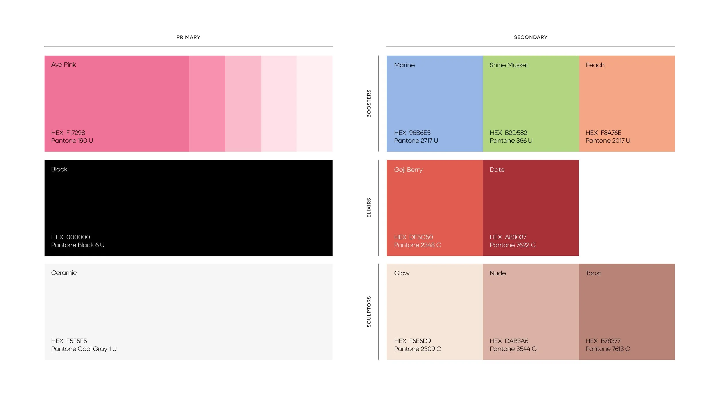
The primary palette is built around Ava Pink, supported by Black and Ceramic. Black adds contrast, clarity, and structure, while Ceramic introduces a soft off-white inspired by the ceramic gua sha tool.
Secondary Colors
The secondary palette is organized by product category, helping byAVA expand without losing clarity. Boosters, elixirs, and sculptors each have their own color family, allowing the packaging system to feel cohesive and easy to navigate.
Packaging System
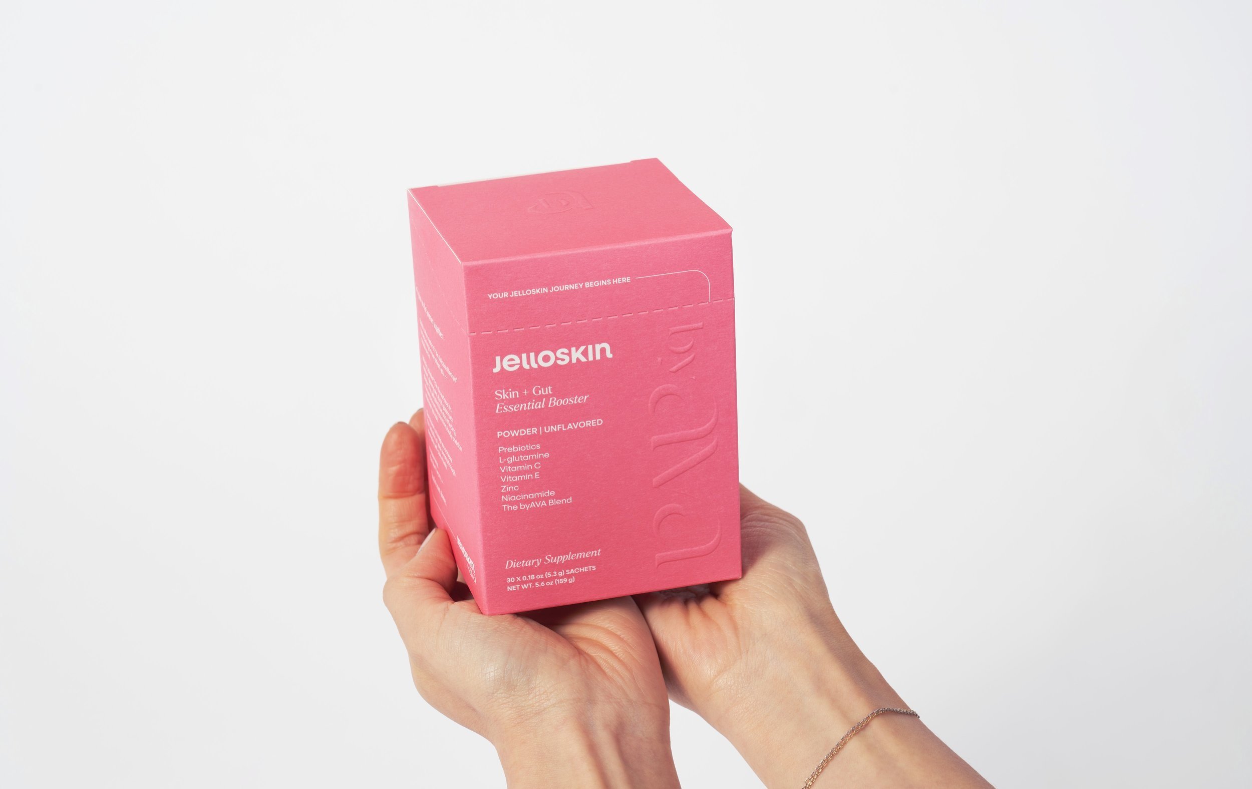
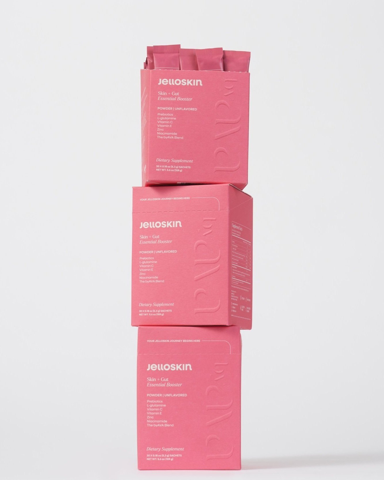
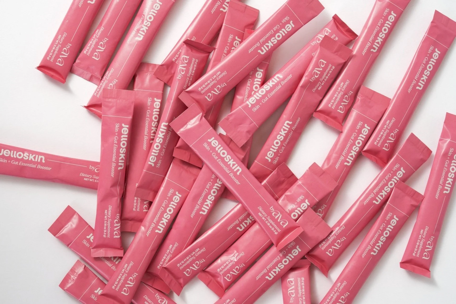
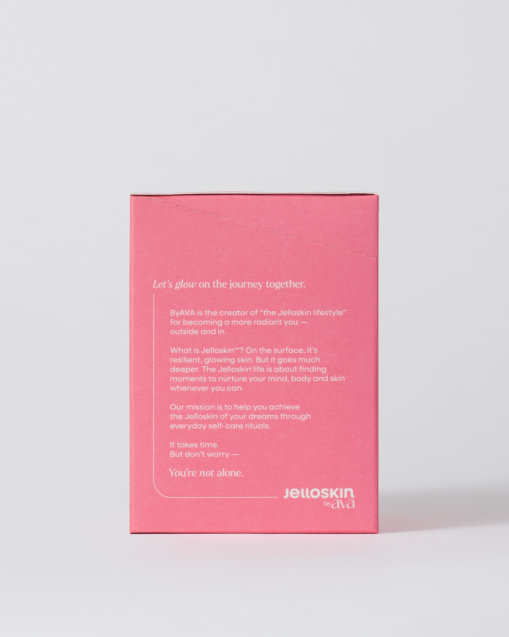
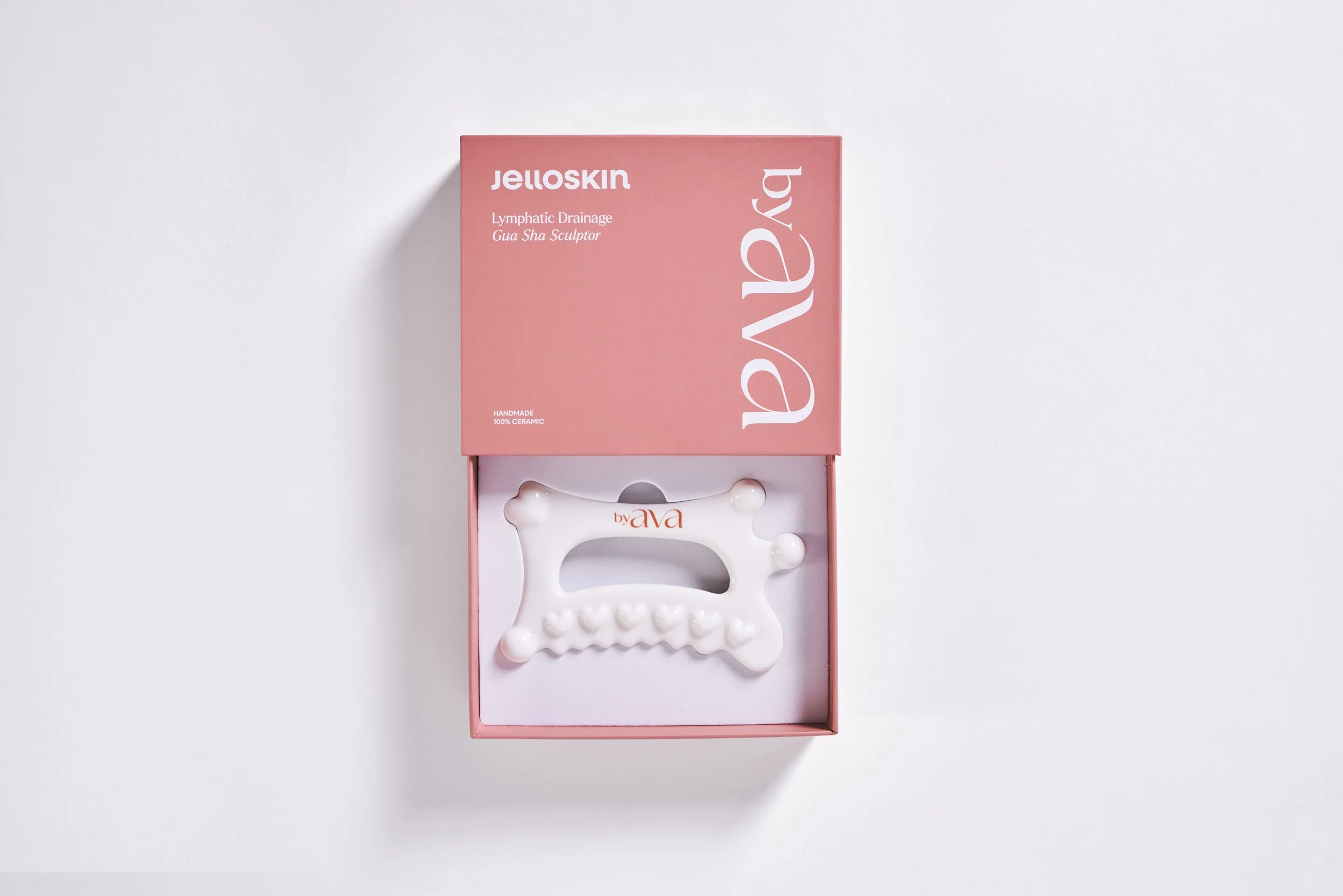
The packaging system uses color as both a brand and navigation tool. Ava Pink anchors the original hero product and the larger byAVA identity, while category and ingredient colors help organize the expanding product line. Within boosters, shades like Marine and Peach create distinction between formulas or flavors without breaking the overall system.
Product Photography
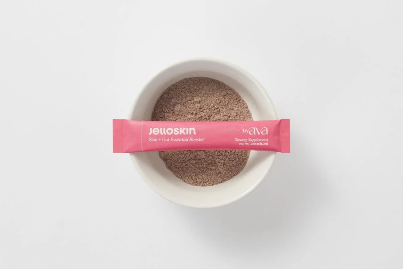
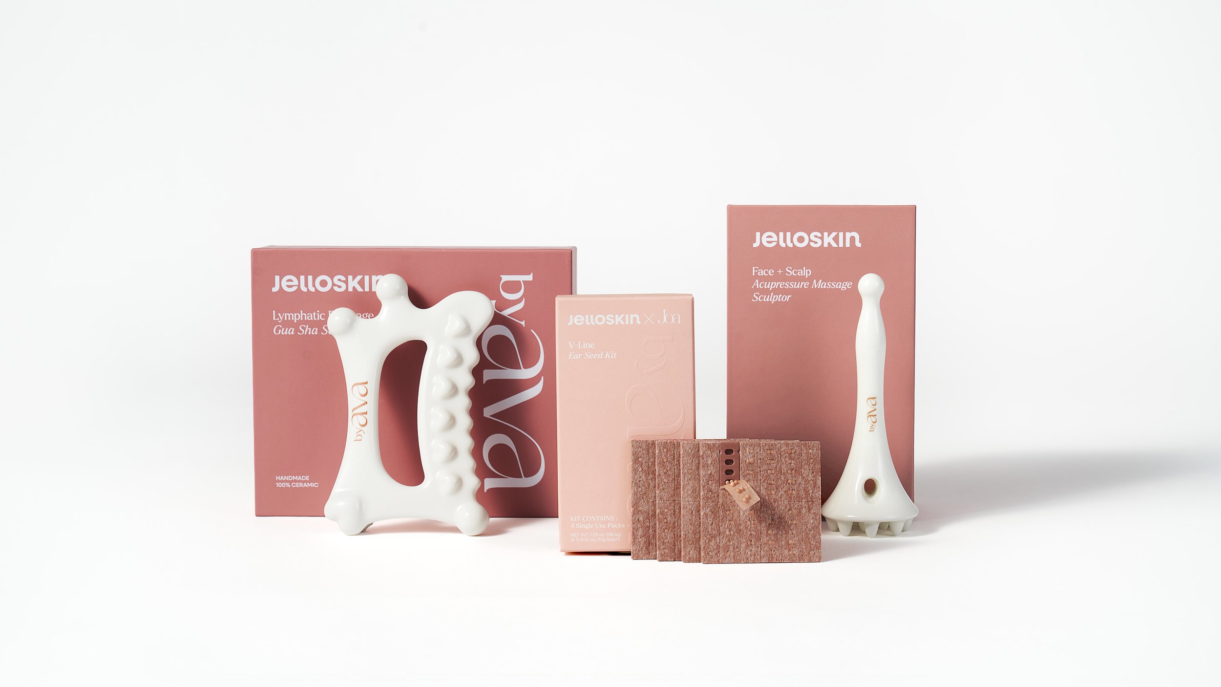
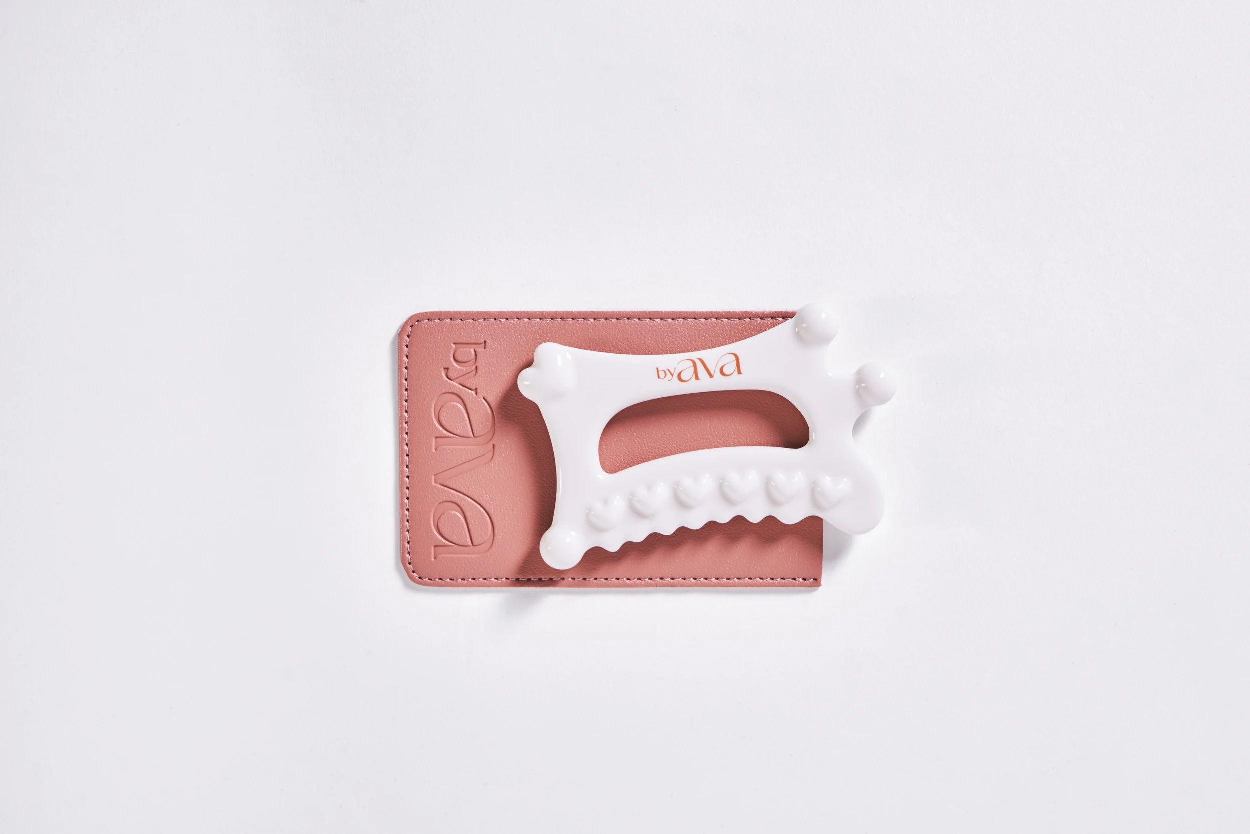
The photography direction keeps the products feeling tactile, intimate, and elevated. Soft light, skin-like tones, and clean compositions reinforce the idea of beauty from within while allowing the category colors to bring energy and distinction.
Boosters
The booster palette supports byAVA’s supplement products through ingredient- and flavor-based color distinction. Ava Pink is used for the original hero booster, which Ava launched with and is most closely associated with the brand’s early recognition. Marine and Peach are used for additional booster variants, helping each formula feel distinct while still belonging to the same product family.
Sculptors
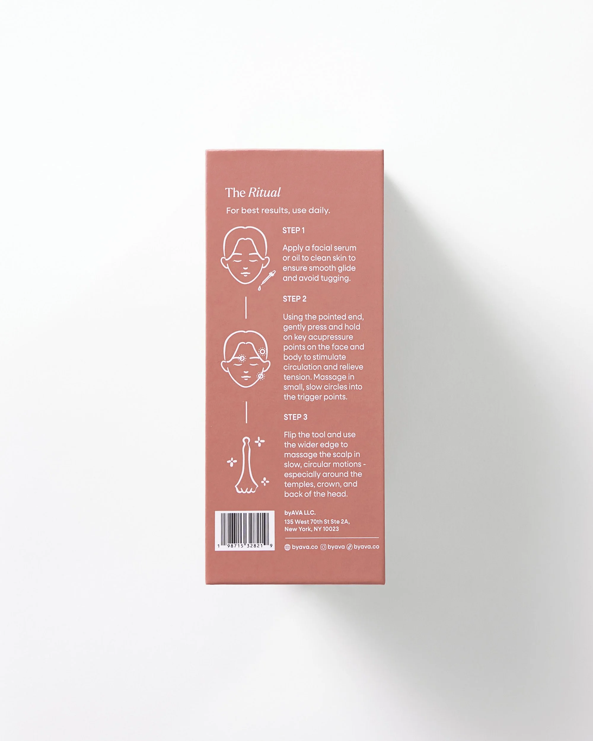
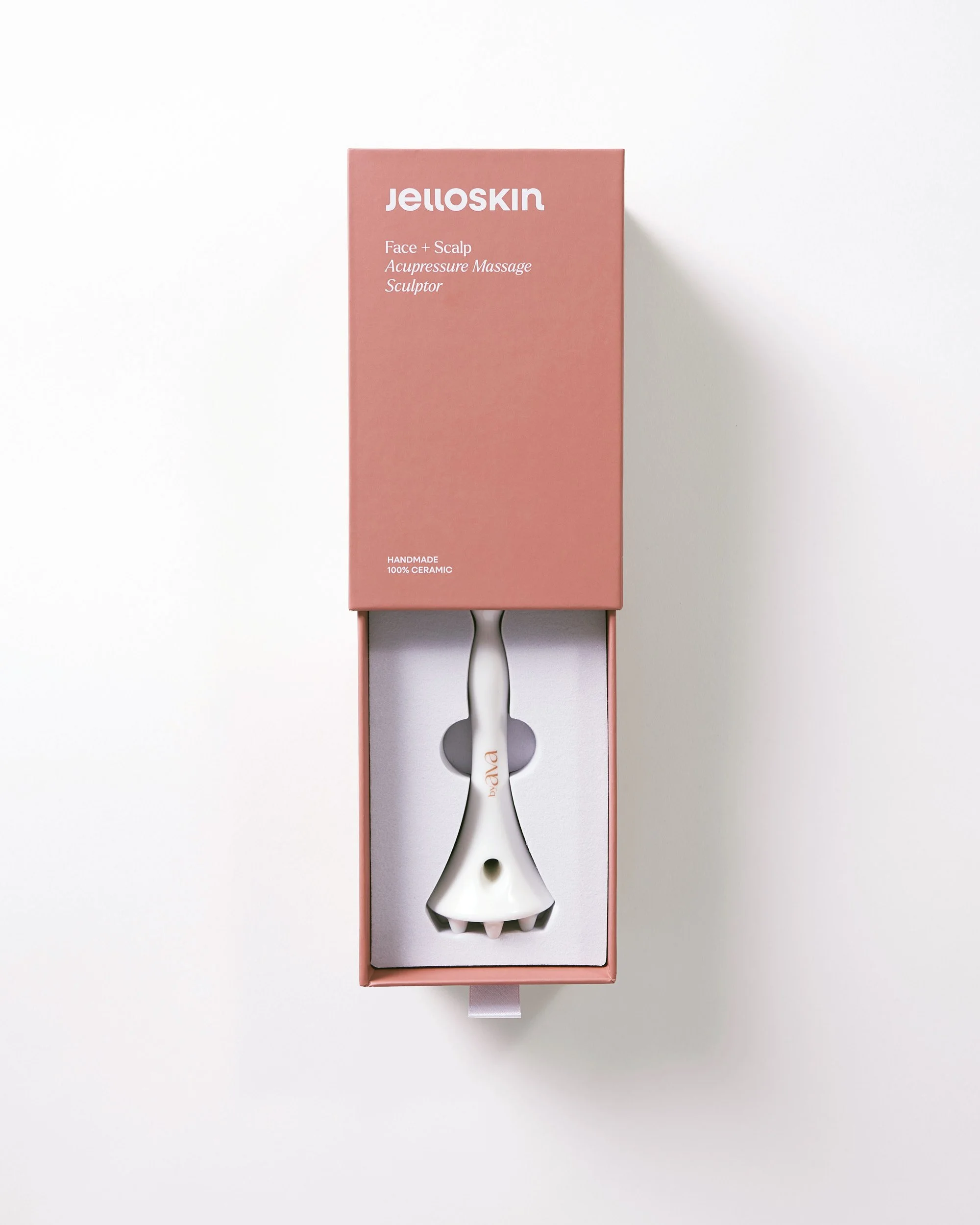
The sculptor palette uses Glow, Nude, and Toast, referencing skin tones, facial massage, and the ceramic materiality of the tools. This category feels softer and more tactile, connecting directly to the ritual of gua sha and facial sculpting.
Elixirs Packaging
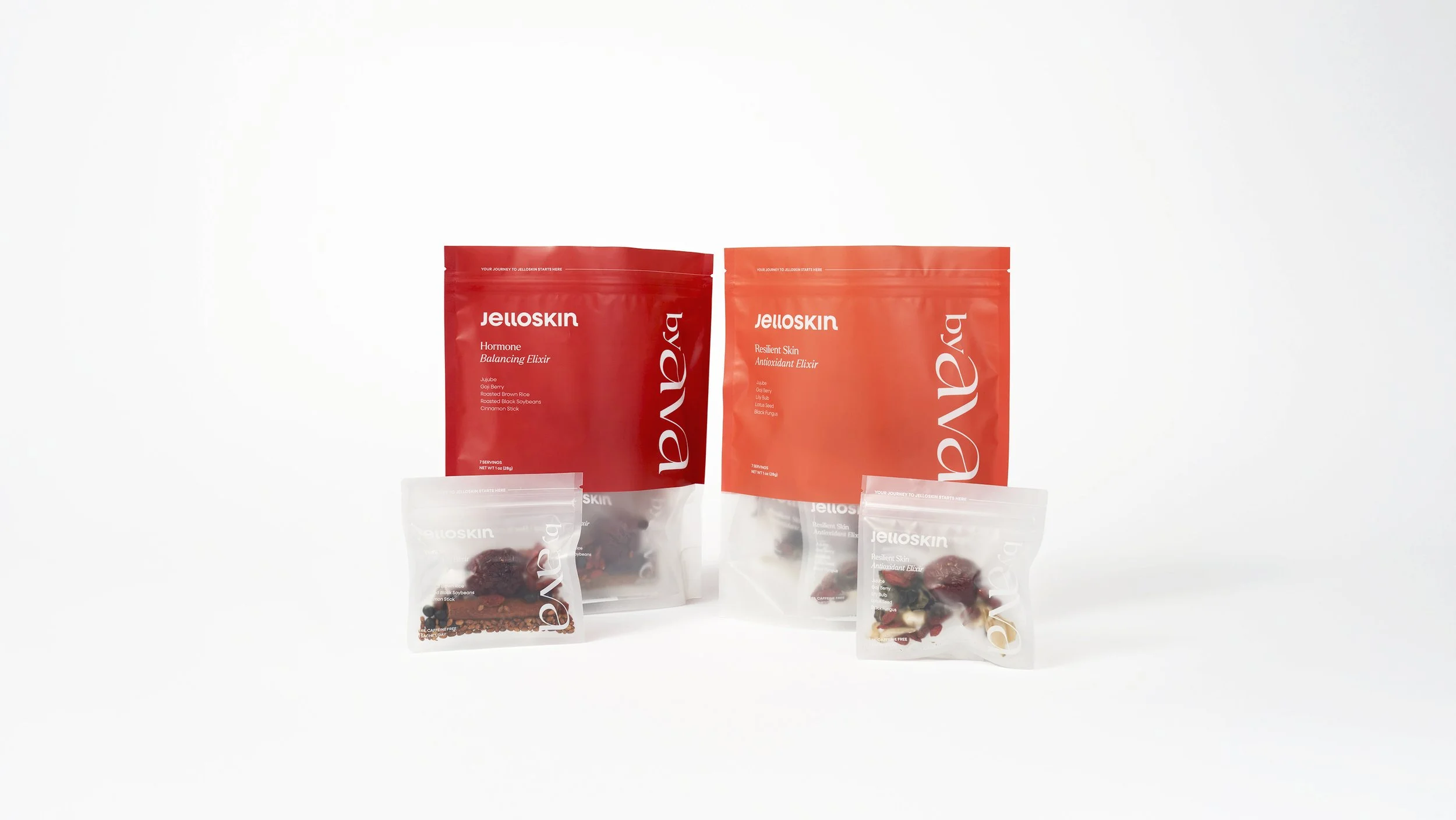
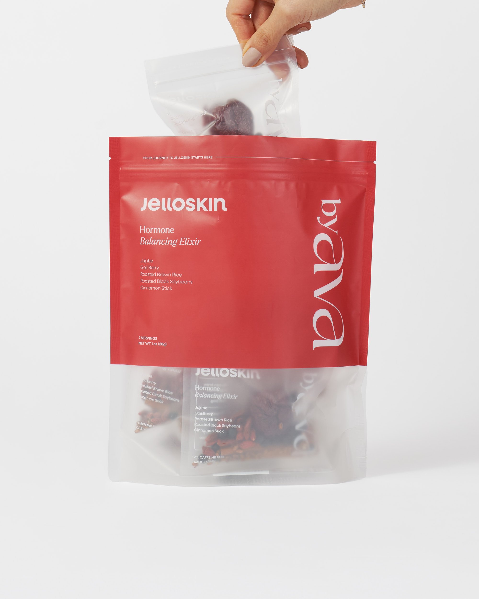
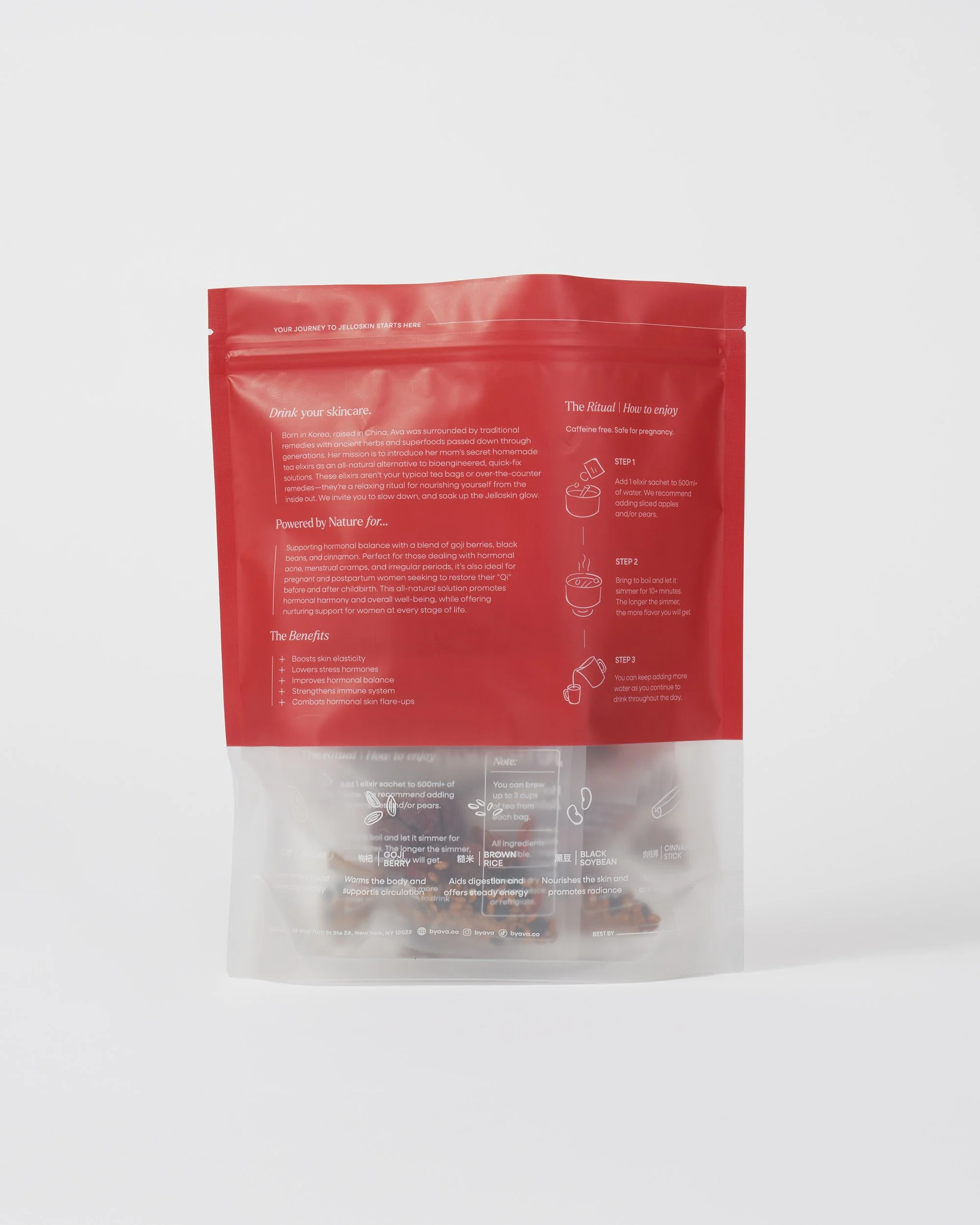
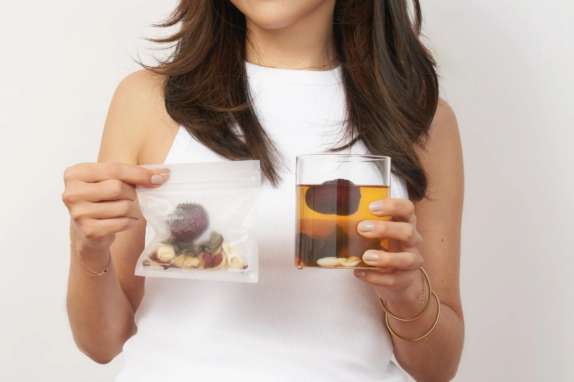
The previous elixir packaging used craft paper bags with a small circular window, which limited ingredient visibility and made it harder to distinguish between products. I redesigned the bags with a half-clear structure so the herbs and ingredients could become part of the visual experience.
A color block at the top of each bag creates clearer product distinction within the elixir line, while the transparent lower half brings more texture, and ingredient storytelling to the packaging. The result is a system that feels more ownable, easier to navigate, and more connected to the ritual of herbal wellness.
byAVA shows how an existing founder-led brand can be completely reworked without losing its original equity. Through a full visual facelift, logo redesign, icon system, and category-based color architecture, the new identity gives byAVA a more polished and scalable visual world while preserving the personal color language that made it recognizable from the start.